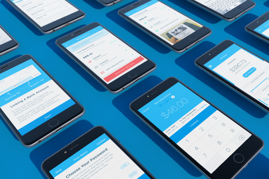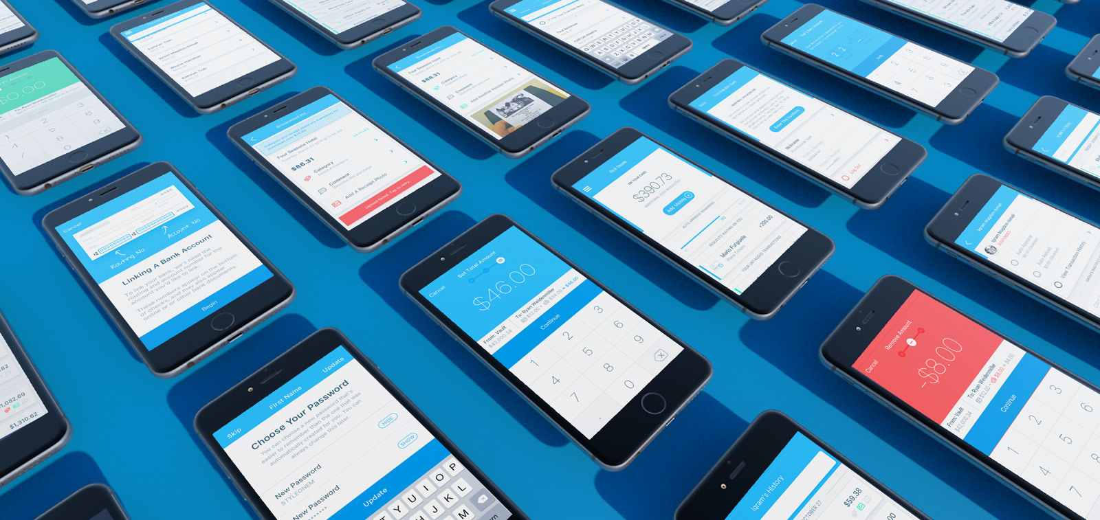
Karmic
Winner of 2 PayBefore Awards: Rising Star and Best Mobile App
Context
When your employees want to buy something with company money, they get teleported to the 1960s.
There’s thermal paper everywhere, in person reporting, and a whole lot of waiting around hoping things don’t go sideways. Apps like Expensify only remedy the tail end of the process - reimbursement after the money is spent.
In the best case scenario, maybe you have a cash drawer, or a shared credit card that gets passed around.
strong Usually, employees have to float their own cash and hope they get paid back before rent’s due.
That sucks.
Karmic gives each employee a free debit card, and lets managers move money to and from those cards individually, with built in reporting and receipt management, so you can load a card and spend company money like it’s $current_year
Sending Money
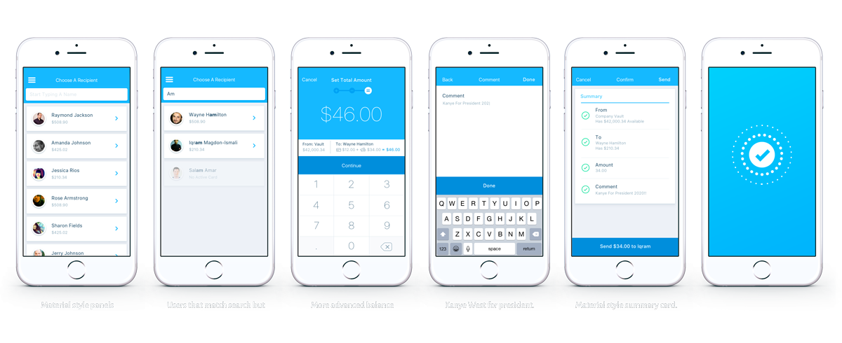
This is the core interaction. The entire usefulness of Karmic’s app hinges on being able to do this one thing really well.
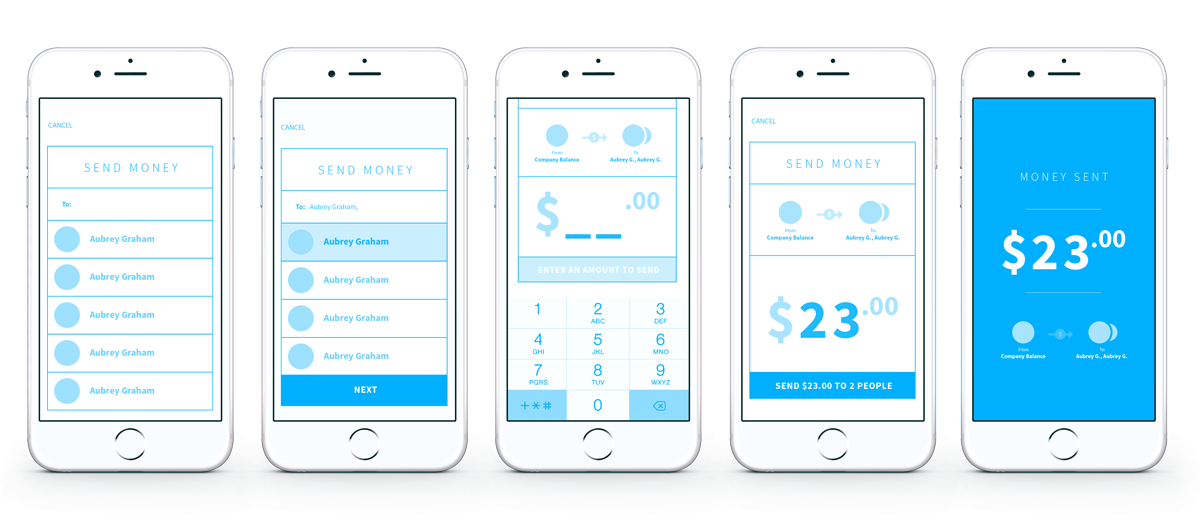
Version 1: Modal
One early idea was a pop-up modal that was accessible anywhere in the app. It started with a search for employees and a simple numpad, with a constantly present visual reminder of what the transaction would look like sender ⇢ $amount ⇢ recipient
The confirm dialog also contained a recap of the amount and recipient.
Much of this survived in some form through the final version.
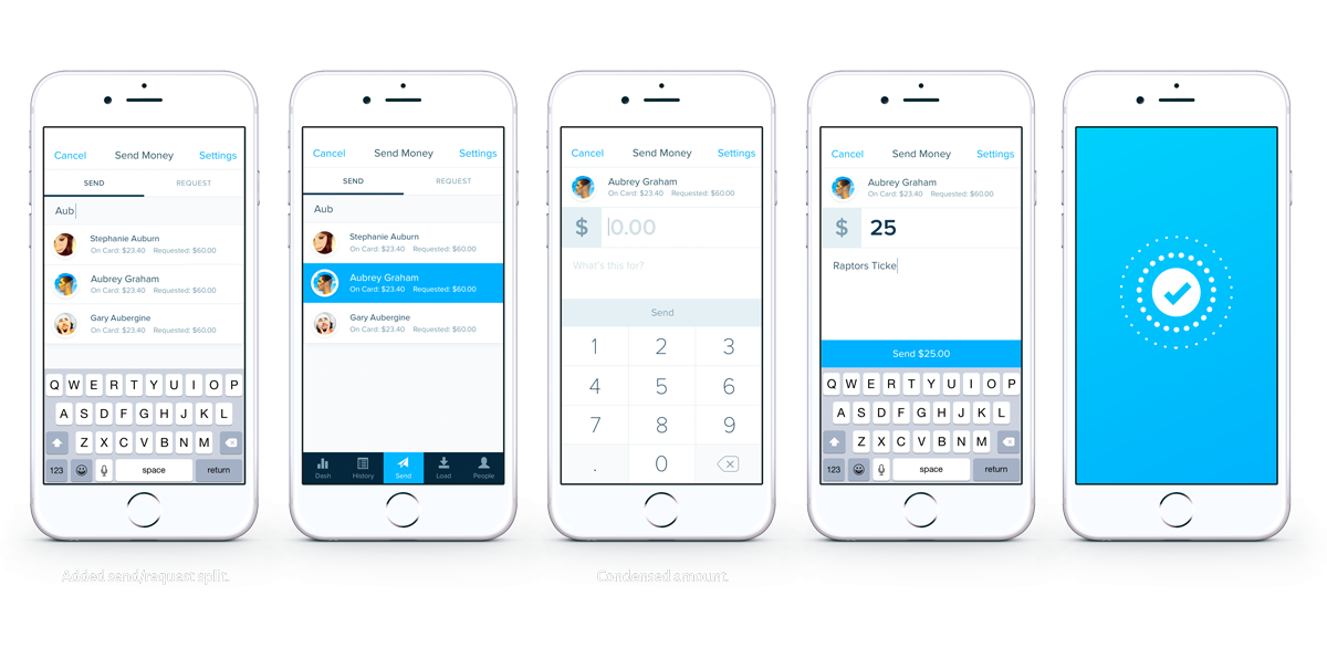
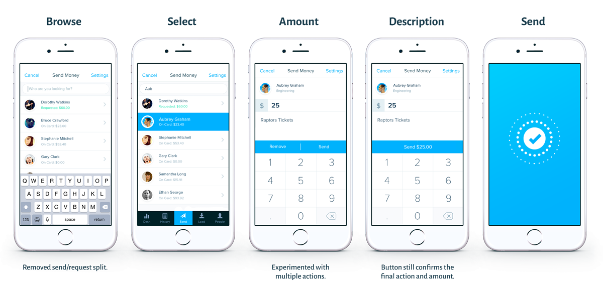
Version 2: Send vs Request Toggle
As we explored different visual design options, this was a pitch that kept most of the wires intact, but ditched the overlay modal in favor of a full screen modal.
The big inclusions here are early in the flow – an experimental toggle between sending a requesting lets users accomplish two very similar actions with the same widget, and the subtitles on the user list gives context for that employee’s existing financial state.
Version 2.5: Double Buttons
We decided to scrap the split between sending and requesting from the same list view, because it caused confusion between things you to do others vs things you do for yourself.
At the same time, we tried using the send button area to offer multiple options. This made a lot of sense in scenarios where choices were very similar, like the split between requesting money and auto-approving money that had already been budgeted. In the case of send/remove, the split felt too strong, and we ended up going in another direction later on.
Concept Graveyard
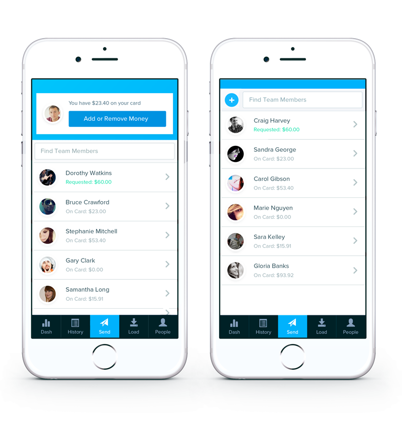
Quick Add
A version of the employee list with a quick-add section up top to let employees make changes to their own card in the same place they modified others.
This layout was shelved because it felt weird to force two significantly different interfaces into a single view, especially when it means adding complexity to an otherwise very straightforward list view.
Version 3: Big Amount / Summary View
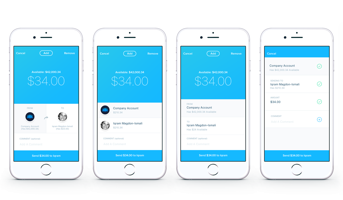
V3 started the send flow process with an empty summary of the send action, and persisted that summary as users filled in the various sections.
We experimented with a few variants of this layout, splitting sender and recipient horizontally vs vertically, etc.
Hallway Testing: Long or Short?
At this point, we forked the send flow into two variants: One showed an updated summary of the inputs so far whenever a user finished an input. The other showed it only at the beginning and end.
I used invision to make a clickable prototype and ran it by everyone in the building, and the shorter flow won.
People’s feedback was that the interactions are short enough that you can keep the summary in your head while you choose a person and enter a dollar amount - the cost of context switching from list to summary to amount outweighed the benefits of more descriptive updates.
Long Version (Interstitial Summary Pages)

Short Version (Summary Only At The End)

Version 4: Action Slider
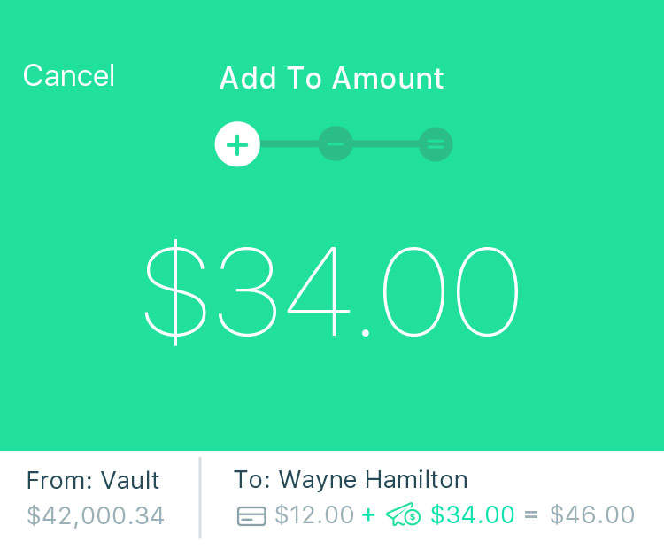
A common complaint about sending fixed amounts is that sometimes you want to send a certain amount, and other times you want to end up with a certain amount. It’s one of the reasons that earlier iterations of this flow included the employee’s current balance.
But we were still forcing people to do mental math if they wanted to base their send on the “ending with” amount.
This change finally remedied that problem, and gave us a neat way to include the “remove” functionality from before at the same time.
There were also some tweaks to the summary on the amount screen, making it more pronounced.
Add Amount
Adds the given amount to a user's card. The summary at the bottom highlights what's being done.
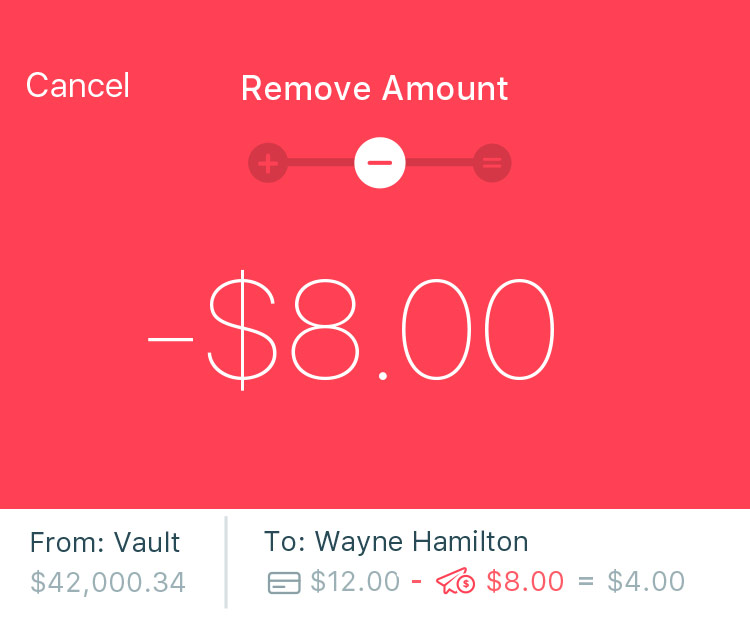
Remove Amount
Remove the given amount from a user's card. If the amount entered is more than the user has, just empty the card.
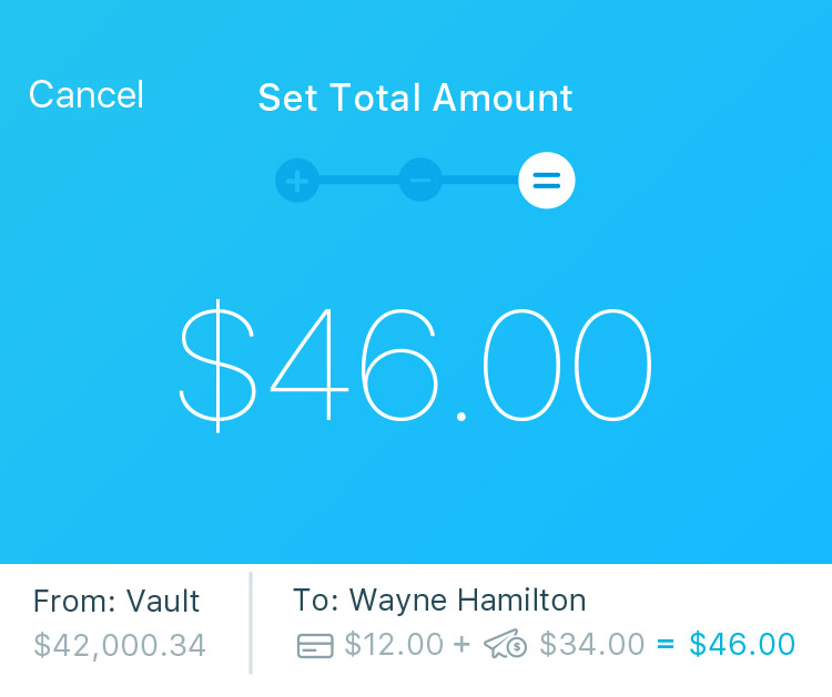
End With Amount
Set the amount the user's card should end up with, and Karmic will do the math and add whatever it takes to get to that amount.
Web App: Transaction View
The Karmic web app is mostly a layout-adapted version of the mobile app, and is meant only as a supplement to the main mobile app.
One place that shines, however, is the transaction view.
We used the extra space afforded by the larger screen to surface a ton of power-user functionality for the CFO/comptroller types. These users often asked us how to format their data in very detailed, company-specific ways like filtering by custom date ranges and sorting based on their individual accounting categories.
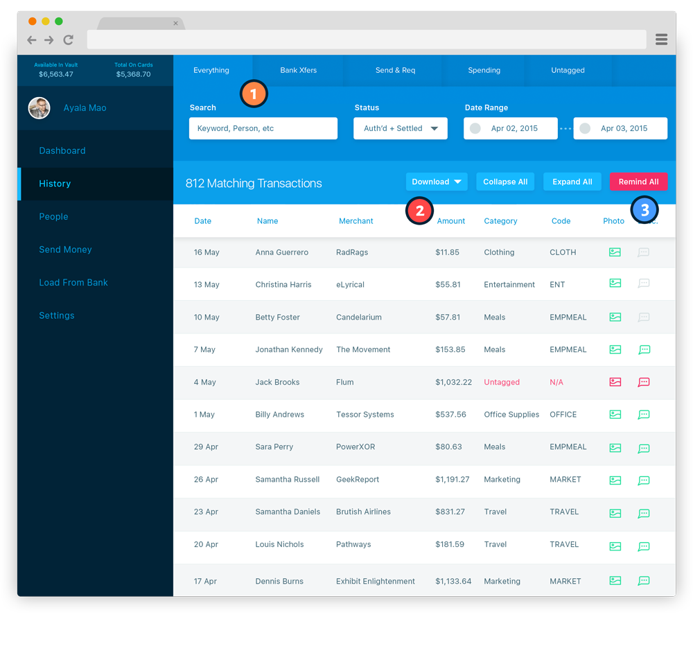
1: Advanced Filter & Search
See events by category, or use search & filter tools to drill down on specific transactions.
2: Your Data Is Yours
Download your entire transaction history any time, for integration with Xero, Quickbooks, and other accounting software.
3: Employee Reminders
Issue reminders to employees whose transactions are missing data you need for complete accounting records.
The Guilloche
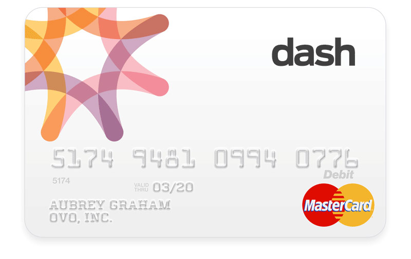
Karmic's card product was originally called Dash. The Dash logotype and mark was developed by Williamson Adams before I joined the company. It was featured in the original card art, but I wanted to explore a more modern look for the Karmic brand.
The Guilloche is a classic visual in finance design, having been added to bank notes throughout history as both ornament and forgery protection. Bank Simple (RIP) had already aced the guilloche-as-logo at the time, so I was forced to look for a separate solution. The answer ended up coming from the original Dash logo, incrementally doubled over itself.


Brand Exploration
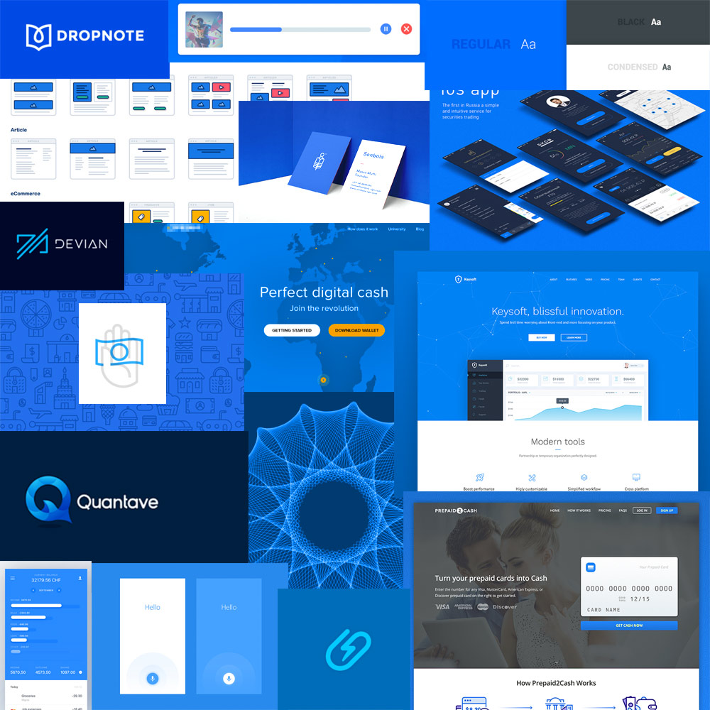
I also designed a moodboard that outlined where I hoped to take the Karmic brand, and while the business chose to stick with the existing brand assets, I’m including it because I really like the way it turned out.
