Samsara's Data Visualization Framework
Context
Data visualization is a core part of Samsara’s products, which provide realtime monitoring and insight about vehicle activity across entire fleets. From speed graphs to driver performance to cost analysis, all areas of the product have some need to visualize what’s going on.
As the company sought to consolidate per-org implementations with a more platform-driven approach (details here), it was critical for the Platform Design team to provide a data UI framework that was flexible and robust enough to accommodate highly varied use cases while maintaining a coherent visual language and reusable underlying resources.
I worked with teams across the organization to audit existing implementations. Having researched pain points, aspirations, and unmet needs, I delivered a data visualization framework that was designed from the outset to scale gracefully from both a design and engineering standpoint.
Research
Design Research
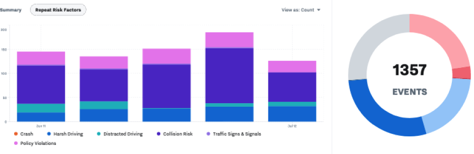
Given the amount and significance of the data visualization practices already happening in the product, the first part of requirements gathering involved auditing and documenting everything we did in the product, extrapolating similarities and identifying opportunities for consistency.
There were two categories of team that it was critical to speak with: the highly visible ones doing middle-ground things that get 80% of the traffic, but also the 20% of teams building demanding tools at the edge of our capabilities. I wanted to to make sure we were aware of where the product is already colliding with the edge of our current abilities so that V2 could offer sufficient headroom, rather than just giving the ambitious teams a shinier version of a ceiling they were already bumping into.
Engineering Research
My front end background enabled to me to simultaneously audit the product from another angle: looking at our existing implementations from an API standpoint, seeing what was shared, what wasn’t, and talking to engineering about what was easy and hard.
Recharts.js
A topic that quickly emerged was our charting library: well over 80% of our visualizations were powered by Recharts under the hood, and the ones that weren’t should have been. There was almost no in-house data viz library, and the appetite from engineering to develop and maintain one was even smaller.
Existing / Legacy Samsara Styles
Implemented recharts with Samsara’s brand colors
Recharts.JS Defaults
Offered underused niceties like separators and grid lines
Thankfully, no such effort was needed. I spent some time investigating Recharts’ API and capabilities and found that it was plenty robust and – importantly – highly themeable as well. One unpleasant scenario would be finding that we were married to a library that met our technical needs but was destined to look like the pychart defaults. I partnered with members of the front end team to investigate alternatives just in case, but we came away happy with Recharts abilities relative to the competition.
Catching this early was huge for the project. By adding Recharts components alongside the product audit, I was able to design our library against the real APIs it would be implemented with, ensuring that our engineering asks were realistic, achievable, and worked harmoniously with what the library was designed to do.
Recharts was also a great source of inspiration: it’s a mature library that’s clearly seen and solved a lot of problems in a lot of places. There was more than one occasion where looking at their implementation offered an elegant feature or solution that wasn’t on my radar beforehand.
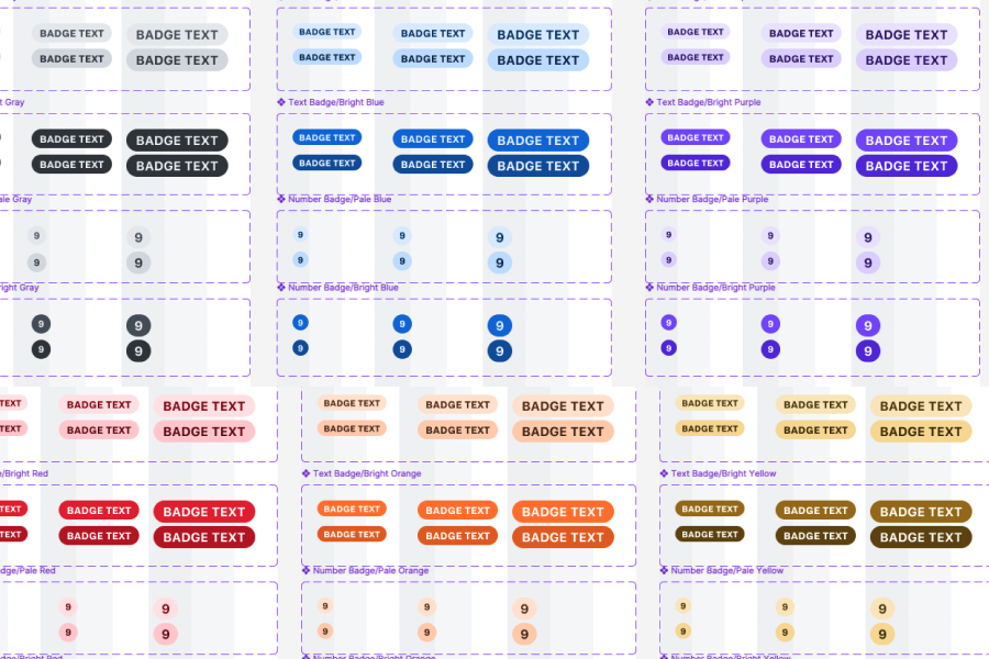
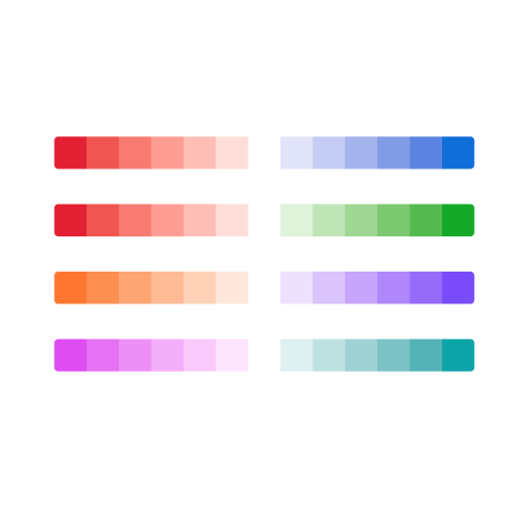
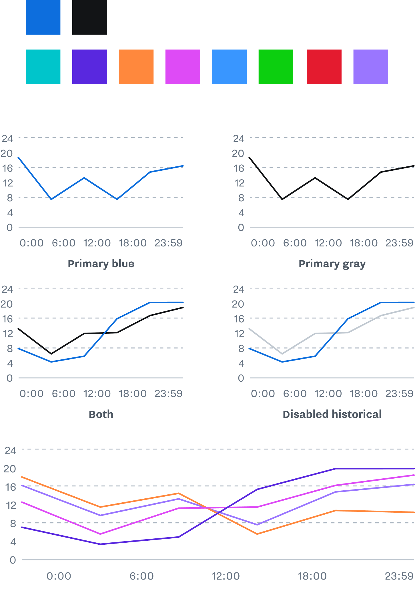
Upgrading Our Colors
There were already some established conventions, like the use of brand black and blue as default colors, and expansion with teal and purple, but anything more complicated was left undefined.
Based on my past experience working at Adobe (and particularly, with great colleagues like Nate Baldwin), I added palettes specific to data viz, based on best practices for different use cases.
There’s a lot more that can be said about the decision making process here, and what makes each solution appropriate for one problem but not the others. It’s beyond the scope of this case study, but something I’m happy to nerd out about if you’re interested.

Categorical Colors
Text about what categorical colors are
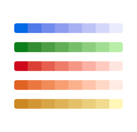
Sequential Colors
Text about what Sequential colors are
Divergent Colors
Text about what Divergent colors are
Basic Styles
Updated guidance preserved existing practices like our default colors, while expanding our palette to enable graphs that include a wider variety of data.
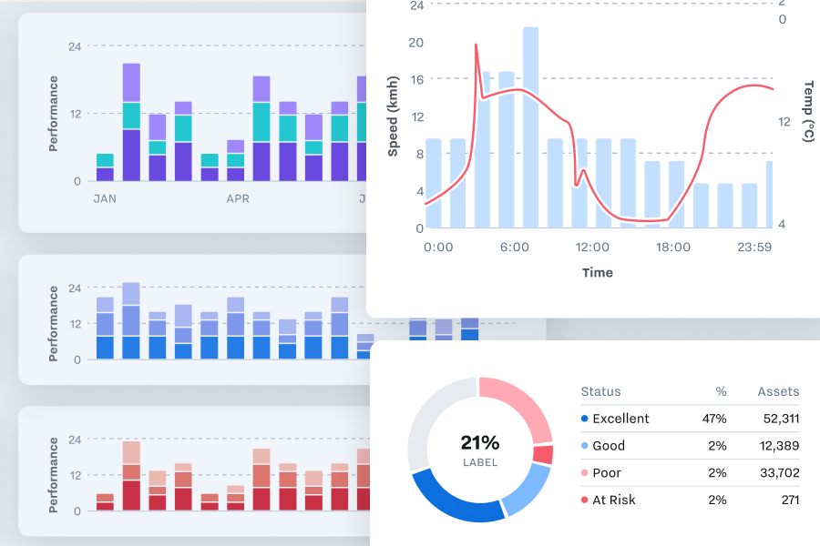
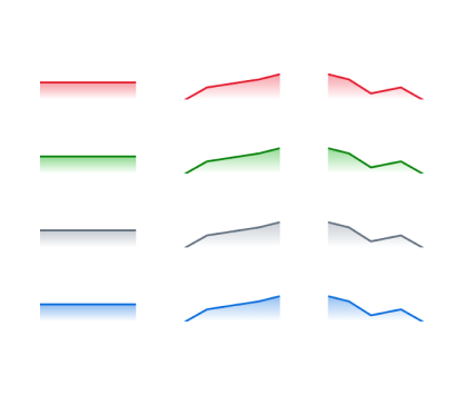
Differentiable Strokes
Accessible stroke styles use weight and pattern to differentiate the parts of a chart and convey all necessary information without relying on color.
Establishing a visual language for these functions enables our charts to describe complicated situations while remaining legible and accessible.
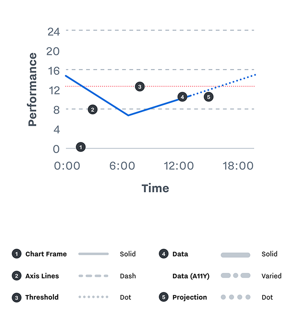
Conventions
Data strokes (2px) are separated from frame, axis, and threshold strokes (1px) based on weight. Data strokes are always thicker.
Axis strokes are separated from threshold strokes by pattern: axis lines are dashed, thresholds are dotted.
Real data is separated from projected data, which is shown with a dotted line.
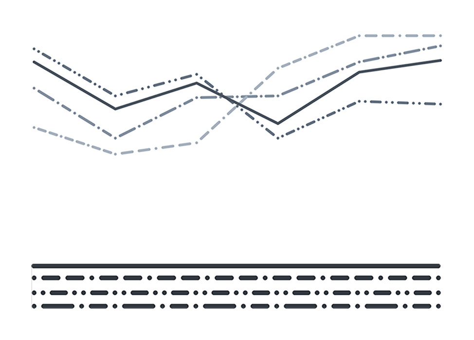
Accessible Patterns
Data lines are also separated by pattern. Strokes use dashes of multiple length, where background strokes are always a single repeating length.
Variations in dash pattern make it easier to follow a single line without relying on color or contrast.
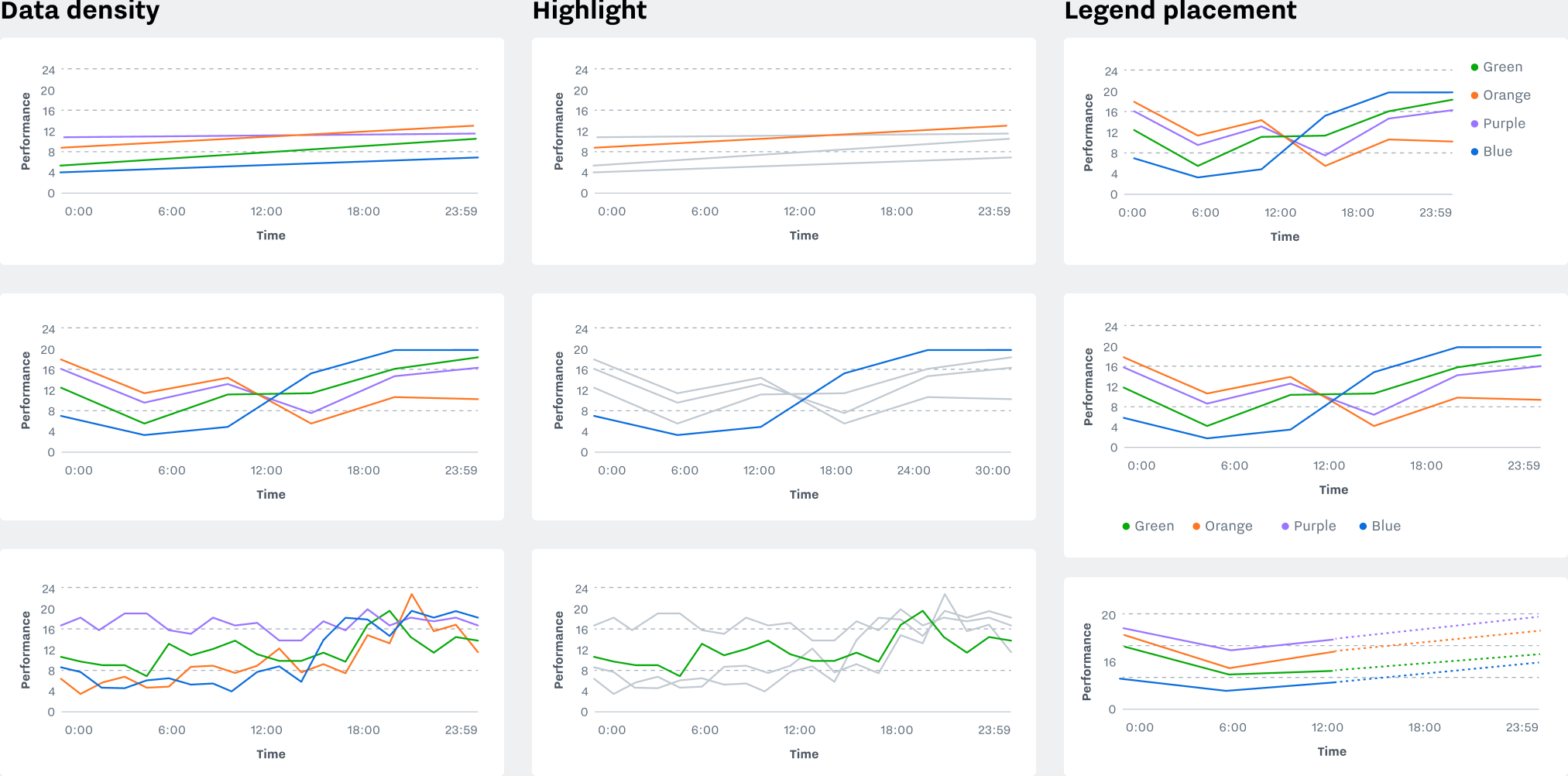
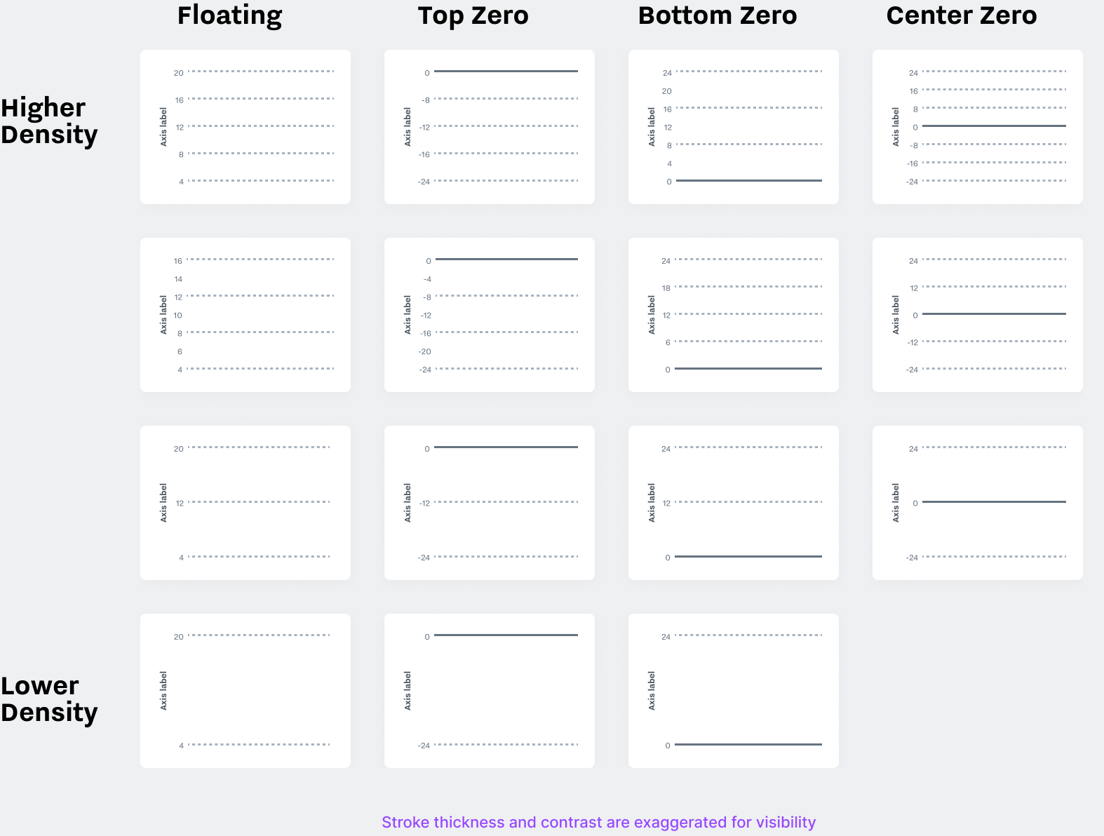
Axis Options
Responsive axis components support multiple densities, and offer different alignment options based on Samsara’s varied use cases. Templates exist for baselines with or without an anchor line at zero, or for axis that extend in both directions to show deviation from a center point.
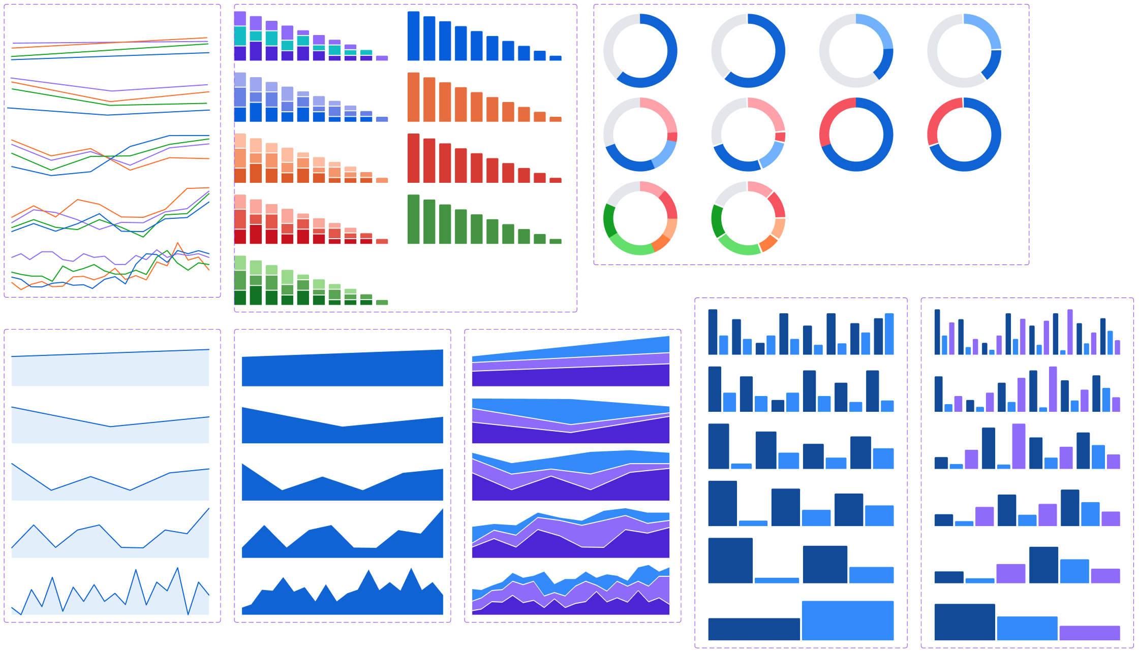
Data Components
The Figma library includes interchangeable, responsive example data for each chart type. Variants are available for multiple densities, and things like the fill percentage of a bar chart can be set from the sidebar.
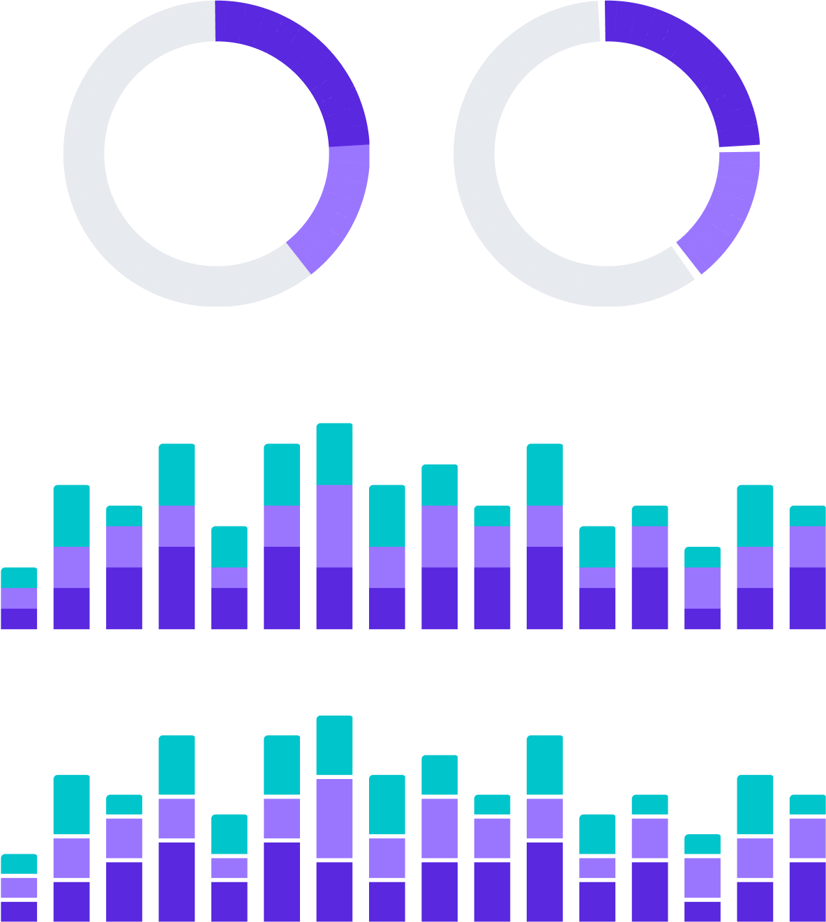
Optional Separators
Separators add contrast and make it easier to see the boundaries between areas, at the expense of (very slightly) obscuring the size of those areas. It’s recommended to use them, but they can be turned off in cases that call for finer accuracy.
Micro Visualizations
These small supplementary elements make information more glanceable and interesting in places like dashboard stats and tables.
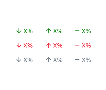
Trend Indicator
Upward, downward, or neutral trends, with a positive, negative, or neutral sentiment.
Spark Line
Small recaps of a trend for use in small parts of a dashboard.
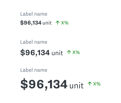
Stat with Label
A core part of the Samsara UI. Text statistics, optionally garnished with things like trend indicators or spark lines.
Filter & Highlight
Every chart variety has support for highlighting individual segments of data, in more than one dimension where relevant.
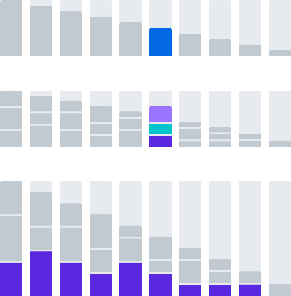
Filtering Bar Charts
1. Single Bar
A single slice of one-dimensional data.
2. Vertical Group
A one bar slice of two-dimensional data.
3. Horizontal group
A one layer slice across multiple bars.
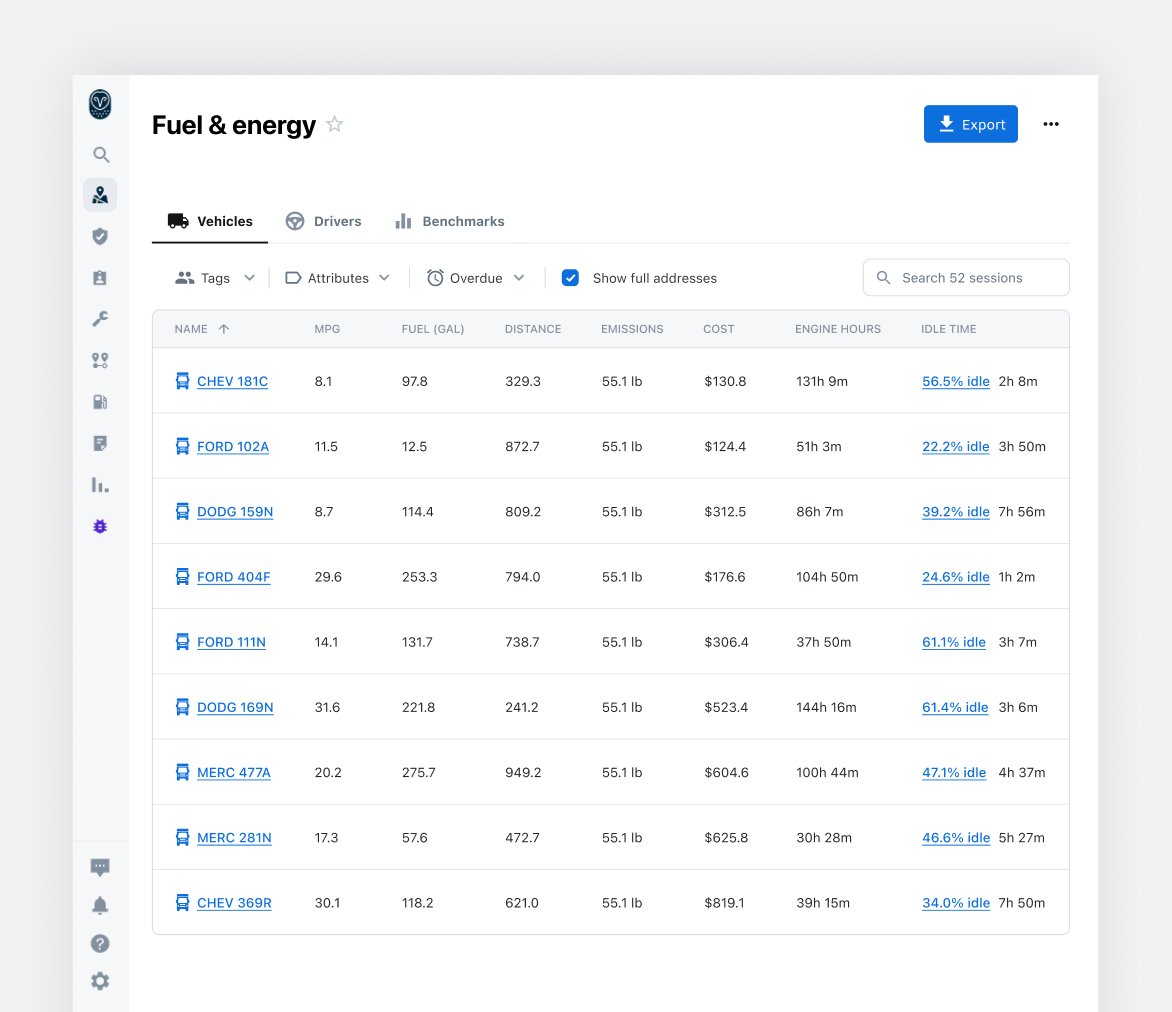
Tabular Data
👏 tables 👏 are 👏 data 👏 viz!👏
It’s common for designers to inherit a complex tabular UI and immediately seek to simplify, visualize, or otherwise abstract it away. But tables are powerful, and they deserve to stay powerful.
The Table Container
In order for table content to support powerful features, it needs to be in an environment that gives it room to work: growing, shrinking, overflowing, etc. The app is responsive, and we need to design for a reality where both the page size and the content size are changing on the fly, including in ways that are inconvenient.
The table container spec included things like multi-directional overflow behavior as part of the very first milestone, informed by observations about where things were breaking in the previous implementation.
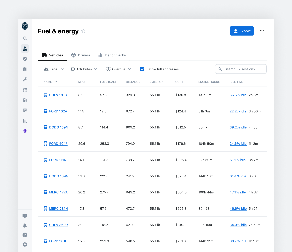
Layout: Full-Width
For many features, the table makes up the bulk of the experience, and any additional border or frame just adds visual clutter.
Layout: Inset
It doesn’t always make sense for a table to get the entire page. Sometimes it needs to coexist with other layout sections or visualizations. For this, we offer an inset table that feels less like a page and more like a standalone component.
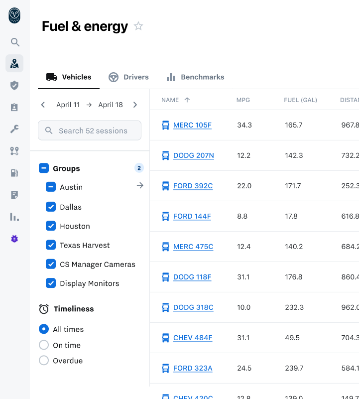
Filter Sidebar
For highly configurable table data, filter sidebars offer multiple benefits.
Compared to dropdown selections, the filter sidebar can show more than one set of options simultaneously, with persistent visibility that doesn’t require hover.
It also offers more vertical space, the ability to scroll, and a more natural environment for collapse/expand behavior.
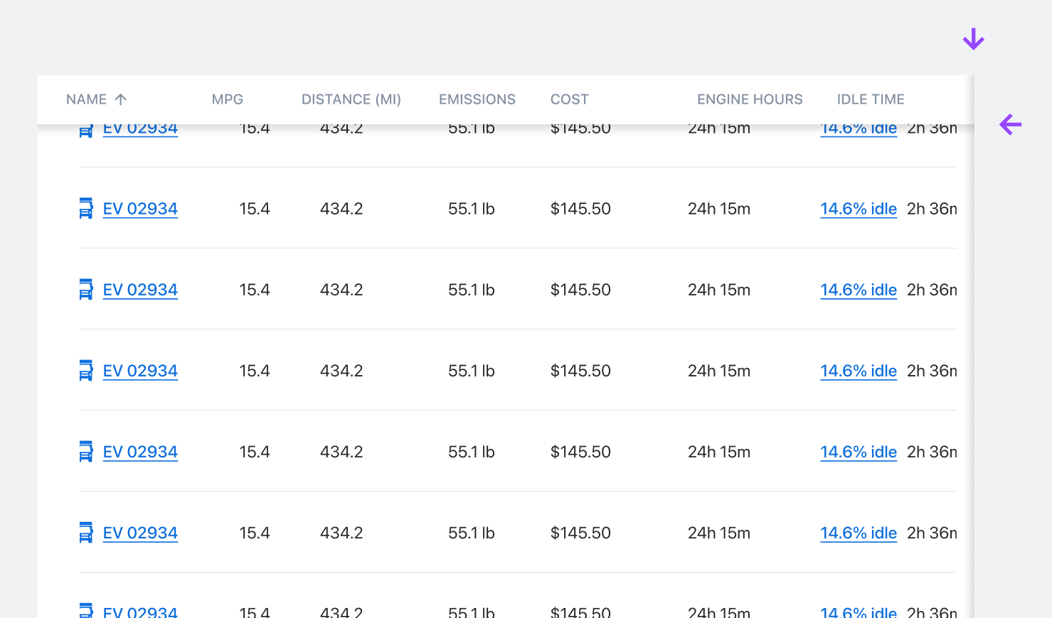
Two Axis Overflow
It’s normal for data to be larger than its containing window, both horizontally and vertically. Shadows indicate when data continues off screen in a given direction.
Attention is paid to the way these shadows are layered based on context. Here, the vertical shadow sits higher in Z space because both the table head and body are overflowing in X space.
Data Modeling and "Entities"
Tables frequently contained multiple columns with sparse data that would be better represented as one item, but that stayed separate because there was no design guidance on how to group that data together.
In working with engineering, I got access to their Entity Relationship Diagram. Much of this data was already grouped together behind the scenes
We identified common entities and data relationships, and created standardized display elements to handle them gracefully on the front end.
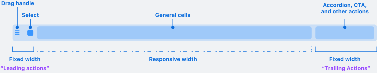
Table Row Anatomy
Detailed documentation about row behavior helps make sure that we’ve considered everything we need to before committing to a direction, and that functionality gets built and tested correctly.
Beyond specifying behavior, these lo-fi anatomy diagrams are useful for creating shared language about each part of the design.
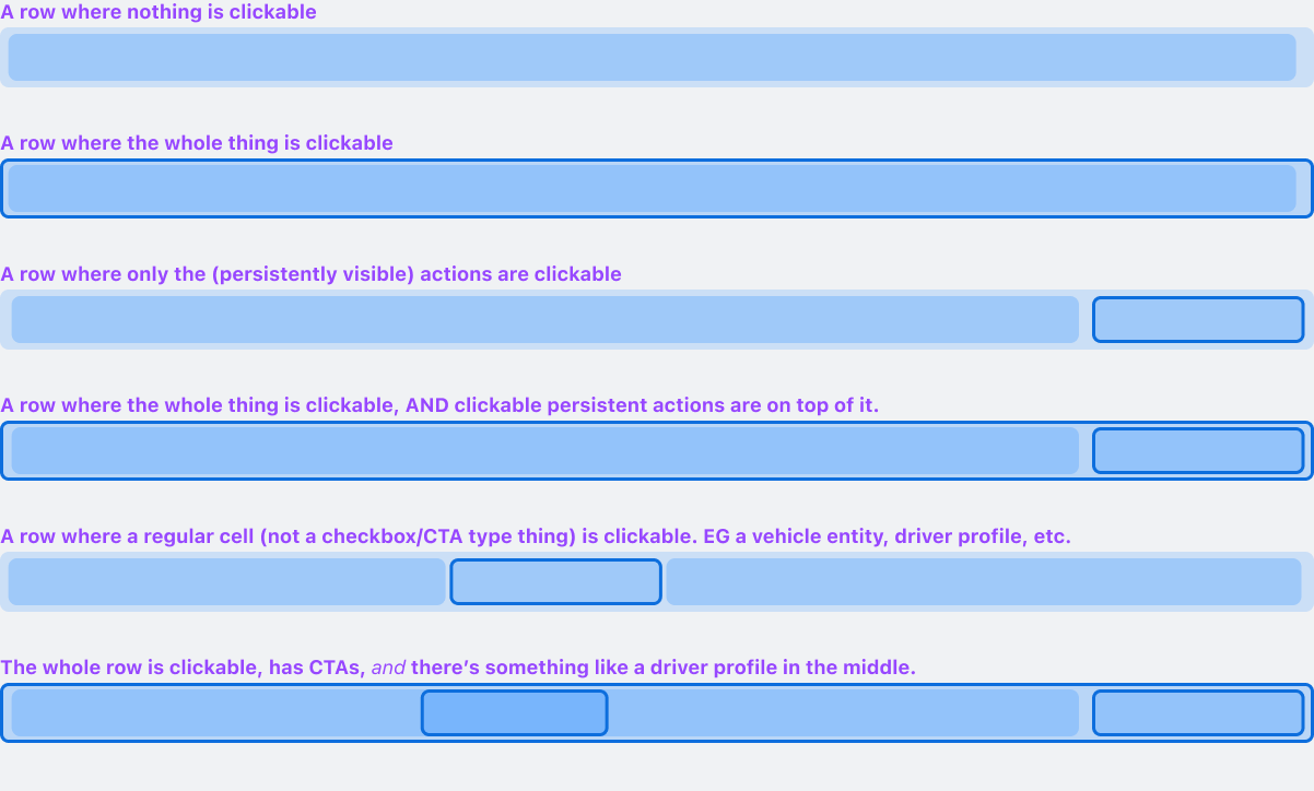
Layering Interactive Areas
Research showed that row interactivity came with multiple levels of granularity.
The spec provides guidance for how to stack these different interactive areas in Z space and propagate mouse interaction to each.
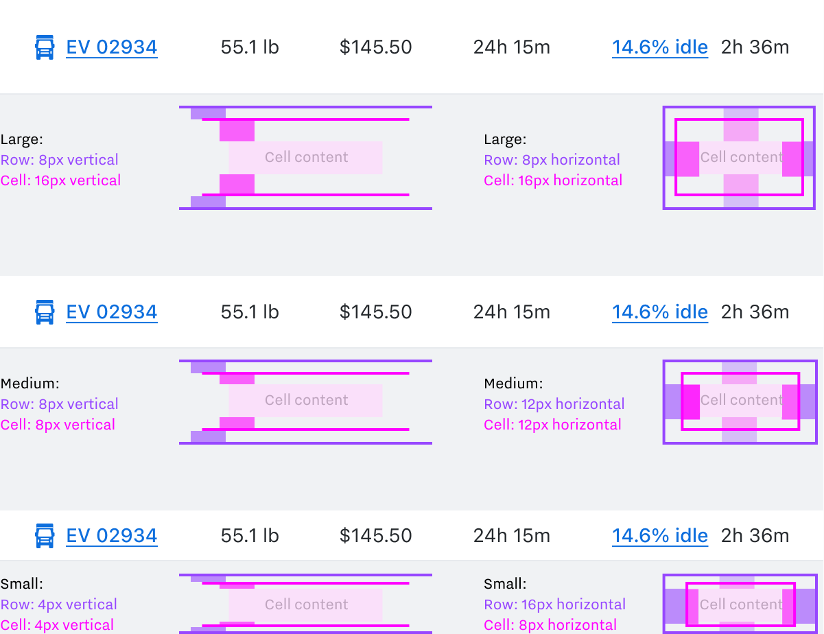
Designing with Markup in Mind
An example of handoff deliverables, providing rationale that goes farther than Figma’s dev mode measurements can. This text accompanied the diagram:
Vertical Spacing
Because row contents are sometimes hovered, the spacing that sets density is distributed across both rows and cells.
If it were only in cells, hover effects would hug row ceilings. if it were only in rows, it would hug cell content.
Horizontal Spacing
Always combines to 24px.