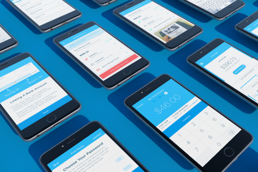
The Remitly Design System
Context
As Remitly scaled its money sending operations from 3 countries to roughly a dozen, managing location-specific implementations became costly. Engineering made the decision to replace the front end with something more maintainable, which was the right opportunity to also overhaul a UI that hadn’t gotten much love in the past
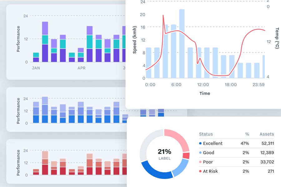
The new design system helped us keep a consistent execution across multiple corridors with customized experiences based on cultural and regulatory expectations, while also serving as a platform for quickly testing variations on the product, scaling to accomodate a complex fintech product with over $39 billion in annual throughput.
Context
Existing Brand
The first pass at a mobile version of this app adhered closely to the existing print guidlines- dark backgrounds, and white text on bright reds and greens. However, it wasn’t long until the glaring UX implications led us to develop an alternate theme that would incorporate form design best practices - especially around error handling, while still feeling on-brand.
Color
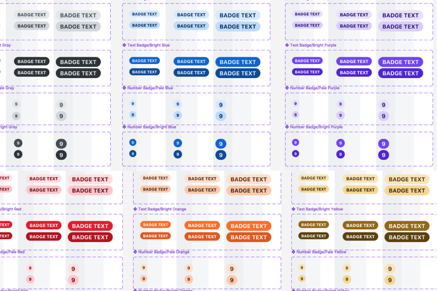
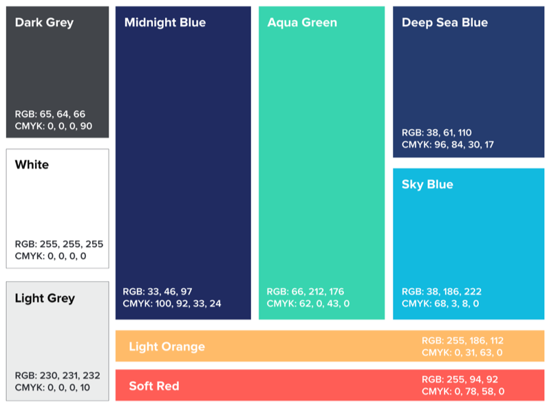
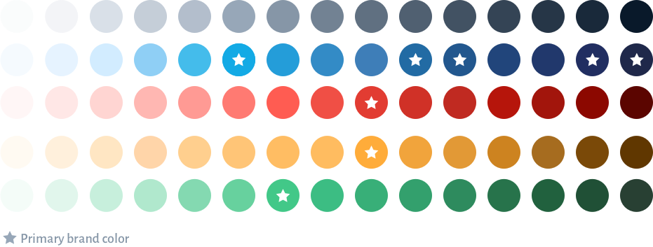
The UI environment is demanding of colors that are less welcome in marketing materials. Yellows become browns for contrast and readability purposes. Hover states mean additional shaded / tinted versions of things. The product design color palette took the original marketing palette and filled in the gaps for performance in a broader set of environments.
Spacing
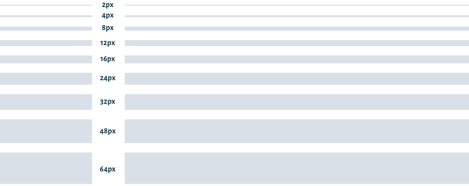
Our spacing began with an exponential scale. It felt like a great start, though we ended up missing some intermediate sizes (12px and 24px) and adding them in.
Typography
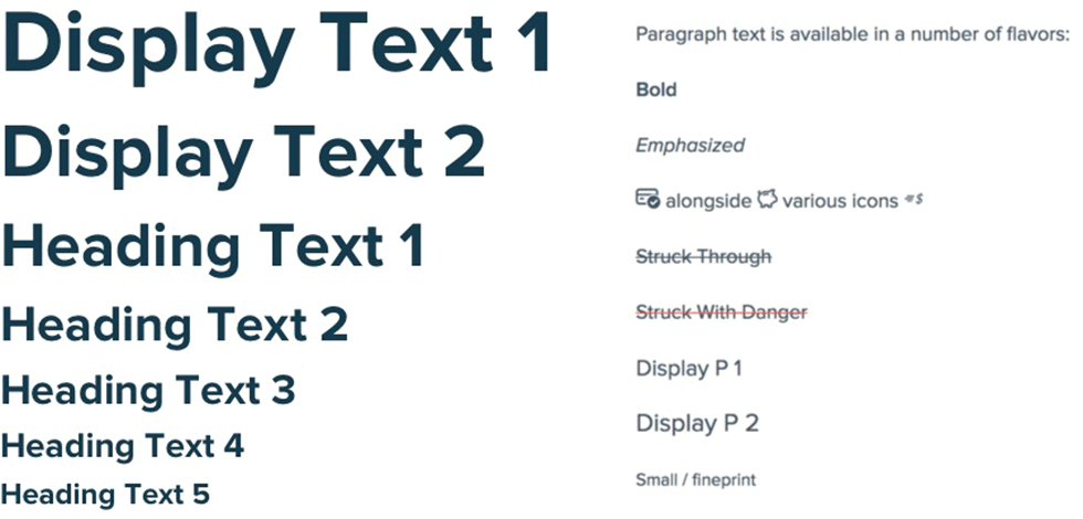
The goal of the type stack was to have a top end that was bold enough for marketing heros, and a bottom end that was robust enough for legal documents with multiple levels of headings. We borrowed an abstraction from bootstrap and extended the headings with two Display sizes that enhanced the h1 while keeping the h1s themselves at a sane size.
Basic UI Components
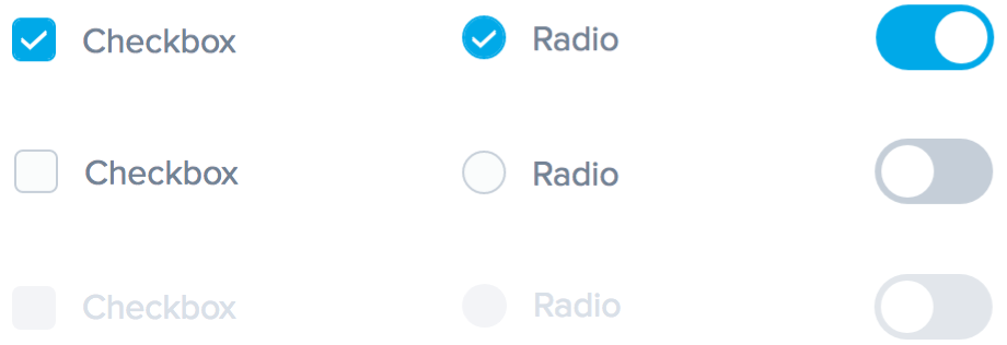
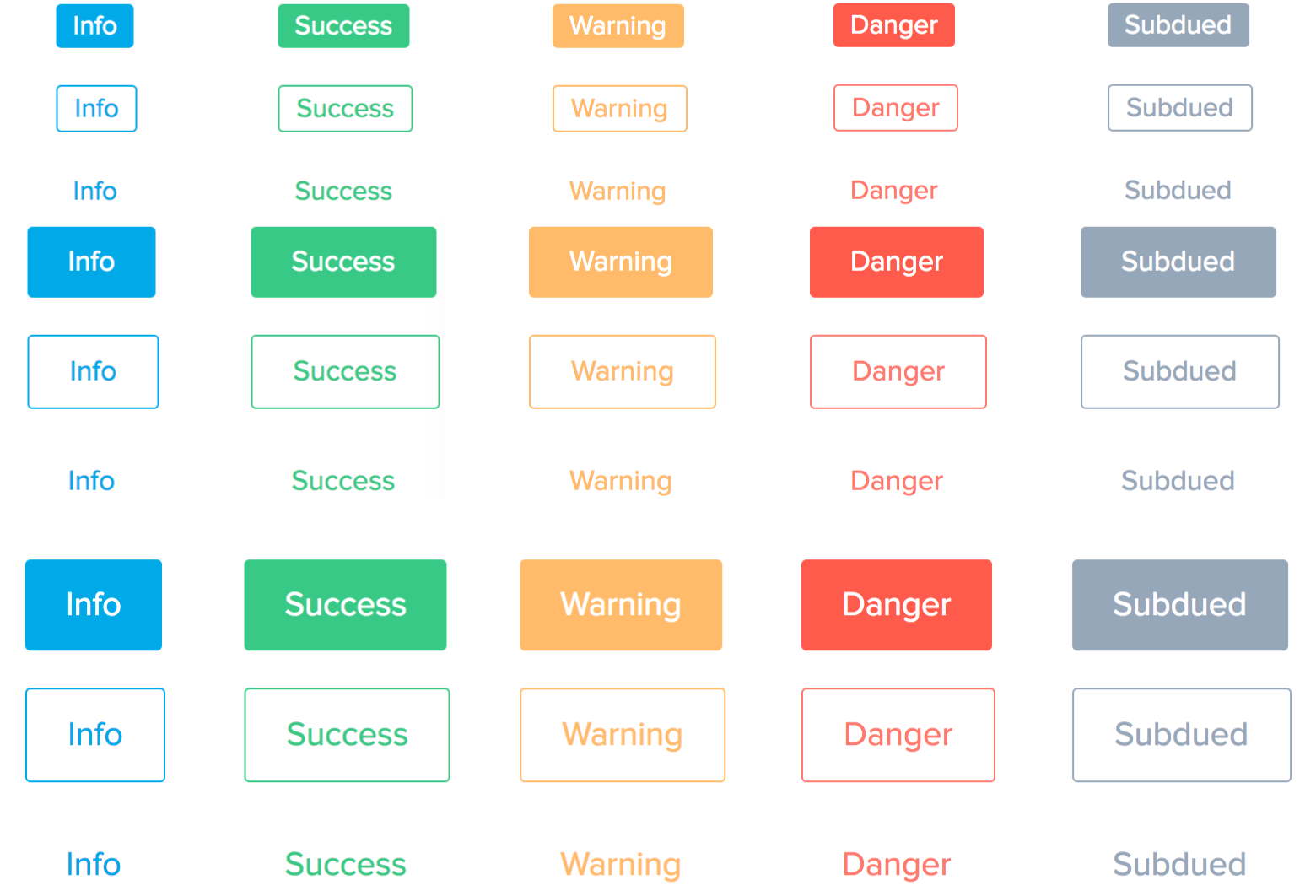
With the core tokens of the design system in place, generalized buttons and form elements were the next step.

Form Best Practices
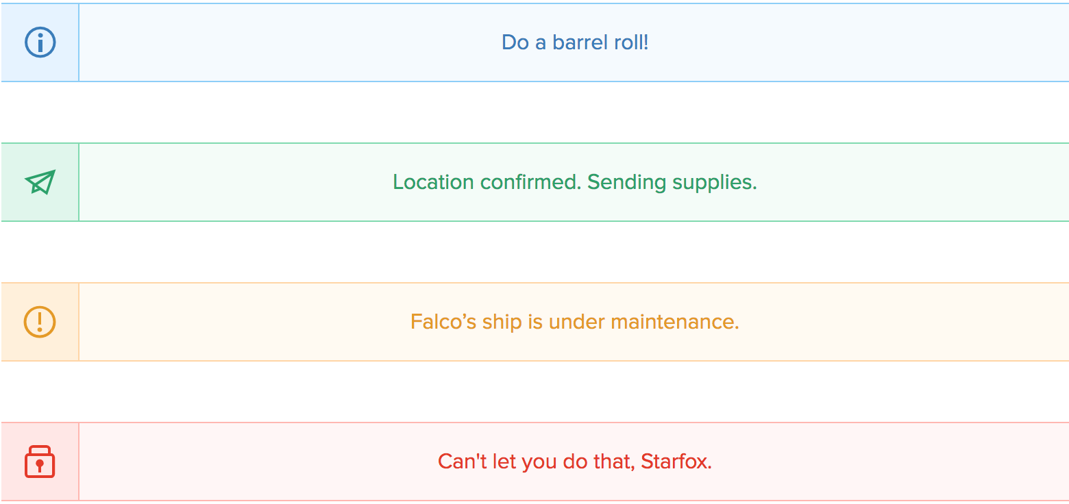
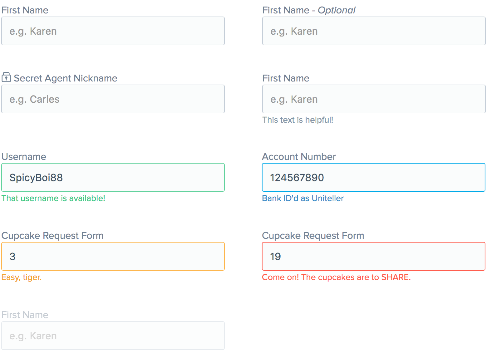
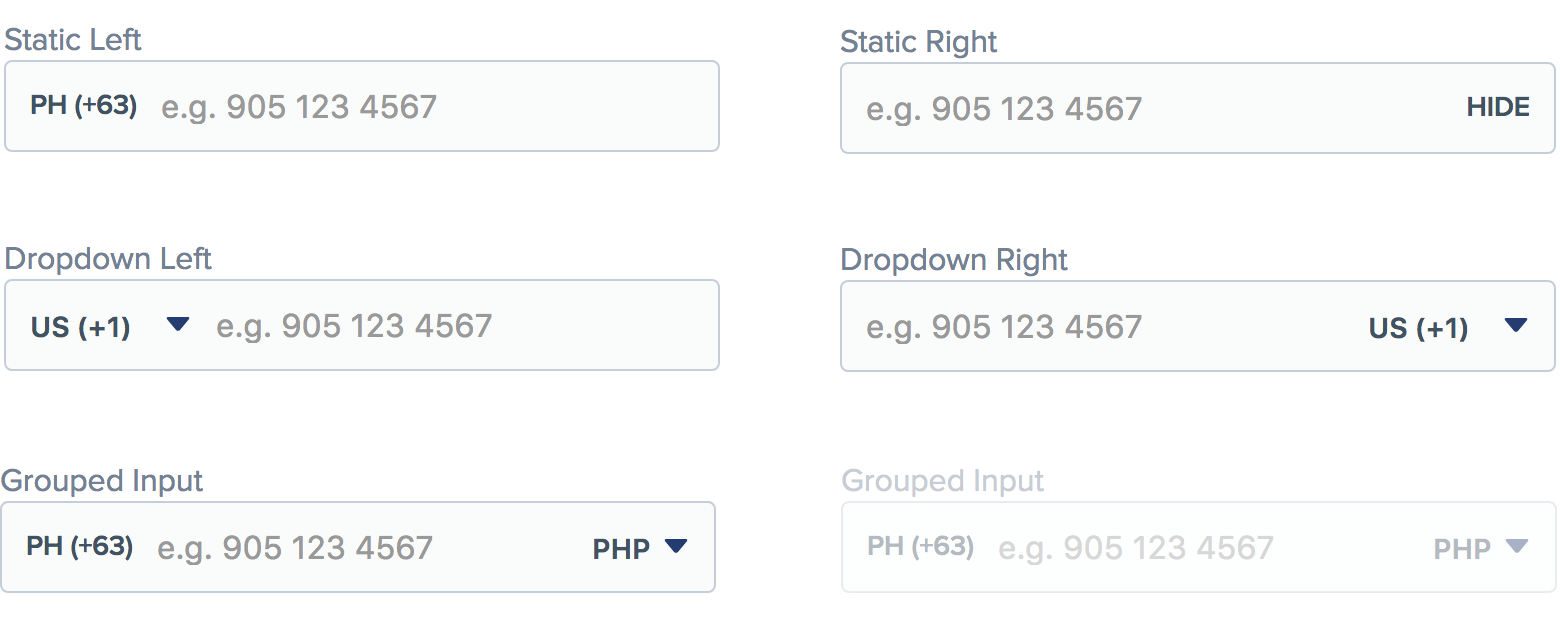
The combination of complex forms and less technical customers gives input design a higher-than-average importance. We adapted best practices from Neilsen, with a framework that supported a wide variety of labels, placeholders, informational text, and alerts.
Tiered Error States
When things go wrong, it’s important to be clear about where. Multiple patterns give the option to couple an error tightly with a piece of UI, or message it more generally.
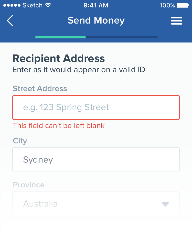
Field Level
When a problem is scoped to a single UI element.
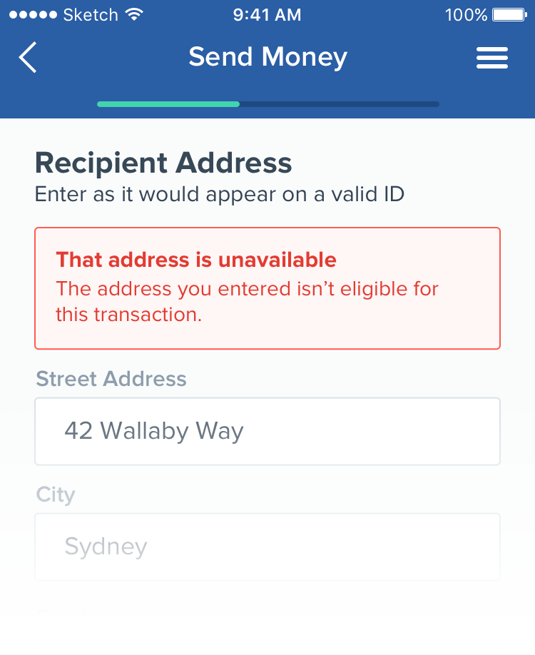
Form Level
Errors on a single part of the page, but not tied to a single UI element.
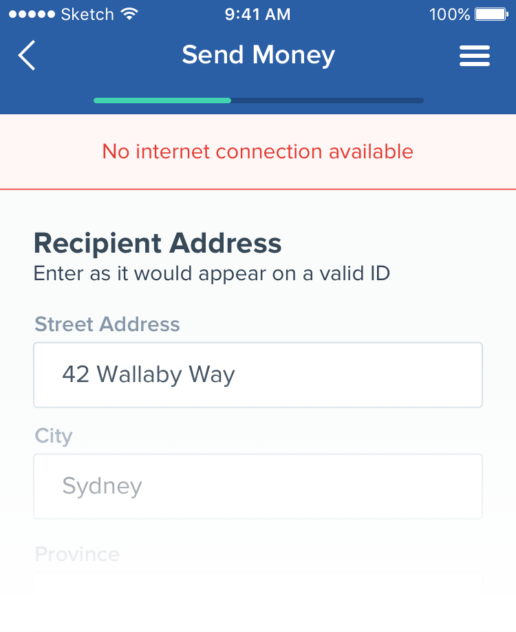
System
Errors above the page level, like a vendor outage or local connectivity issue.
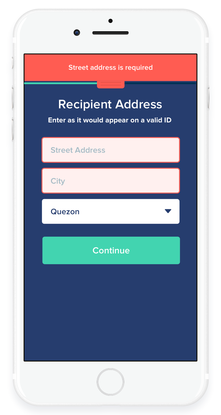
Previous Patterns
One-size-fits-all errors stacked in a top tray because red-on-navy made inline errors impractical.
Requires resolving error 1 to see additional errors
Placeholders as labels - field information is lost during editing.
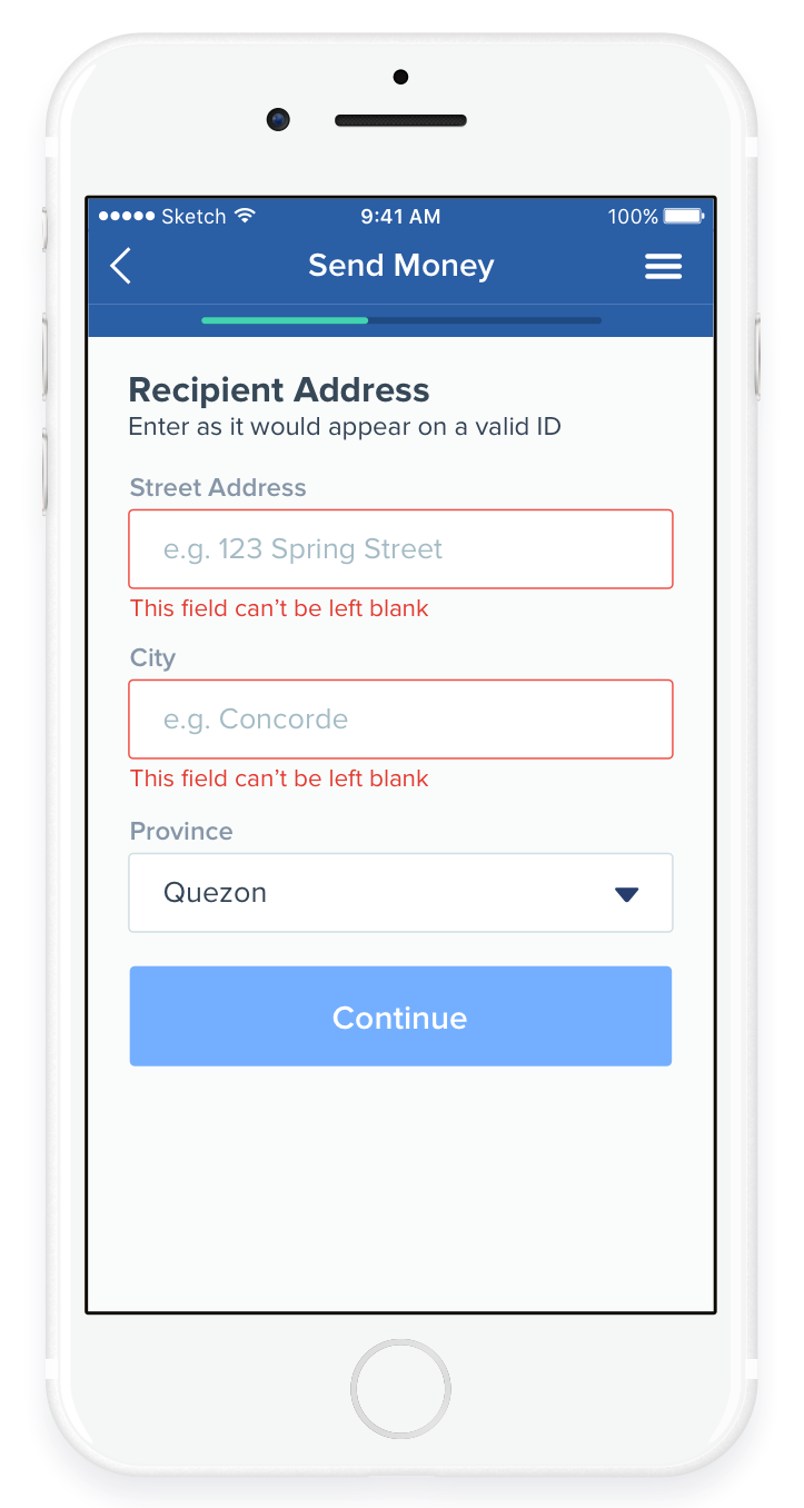
Revised Patterns
Errors can easily be displayed inline at an appropriate granularity. Support for feedback about multiple errors at once.
Label information intact during editing.
Critical extra data (date formats, password requrements, etc) can also be kept intact with help text.
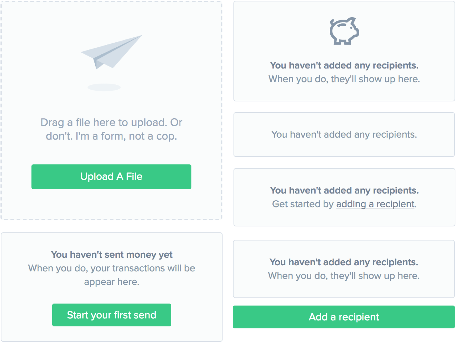
Empty States and File Uploads
Onboarding is a difficult but critical step for financial applications. A multitude of empty states helped users familiarize themselves with the UI before the system was populated with their information. Some states are purely informational, and some have calls to action at various levels of intensity.
Desktop UI
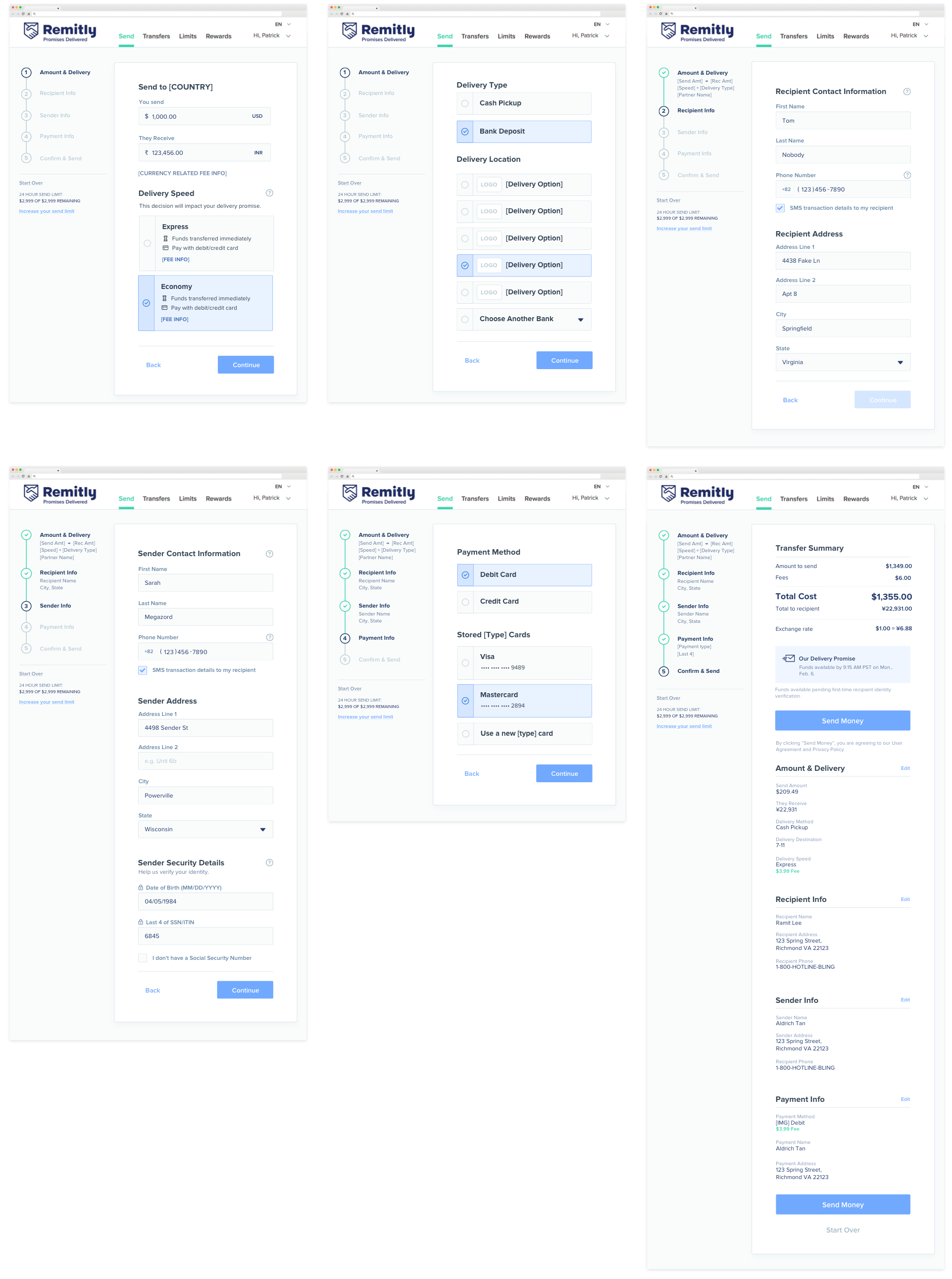
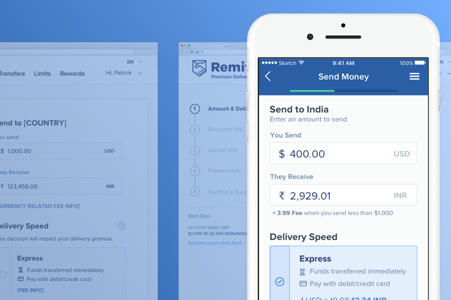
The desktop version extends the mobile patterns and takes advantage of the increase in space.
New navigation lets users know where they are in the process, the status of each step, and a summary of the information they’ve entered.
