Samsara
Updating a legacy design system
Context
When Samsara approached me, their design system had been unmaintained for a number of years and was significantly out of date.
Their product suite had continued to expand during this time. Separate teams added competing versions of new components because cross-org visibility was limited. Components in Figma were implemented differently than mocked, and newly engineered components rarely made it back into Figma.
As a younger and scrappier company, it made sense to accrue technical and design debt in exchange for rapid growth. As Samsara matured, this inconsistency became costly. The now-larger company was competing for contracts in regulated sectors like state and federal government, which brought contractual obligations around accessibility. The design system needed to take these goals into consideration, and the resulting changes needed to generalize well across the entire product.
I worked between the design and engineering orgs to help Samsara repair their foundational styles and components, creating a Figma library that was configurable, accessible, and maintainable.
Figma Library
The design system is a product, and as a product designer, it's my job to remove friction and encourage the behavior that leads to good outcomes. If it's a PITA to put error helptext on stuff, people are gonna do it less.
In talking to users (the design team, in this case) about working with the figma library, there were a handful of concerns that showed up constantly:
Uncertainty about whether a component was up to date or had parity with real implementations.
Uncertainty about whether we had something / what was allowed or considered best practice.
Uncertainty about what's meant to be changed / allowed to be changed, and what we want to keep consistent.
Fear of breaking something fragile and important for other people / at the root level."
Fear of breaking something fragile and important for themselves, by adopting a library with big/unknown/unwanted changes in a critical or legacy file."
As a result, almost universally, designers' solution was to copy and paste things they'd already used from old files.
This makes sense: it's consistent and uses known-good materials. The problem is that these are often detached from the library, not actually consistent across files, and at times are from mocks that are years out of date or otherwise out of sync with what we want to be doing as a design org.
In the worst cases, this would result in something ancient that we'd purposefully removed from the codebase getting re-engineered and reintroduced into the product.
Core vs Showcase
From a Jobs To Be Done standpoint, library user vs library maintainer are very different patterns. I'd liken these to the front and back of a car dealership: one is approachable and comfortable for drop-in browsing, and the other is sprawling and technical, because the two environments are designed to enable separate tasks performed by separate personas.
Designers don't want to – and shouldn't have to – explore every possible combination of the figma config sidebars to discover what each component can do. They do want to quickly browse by sight in an "I'll know it when I see it" sort of way. For this reason, I structured the library in two parts, getting the best of both worlds.
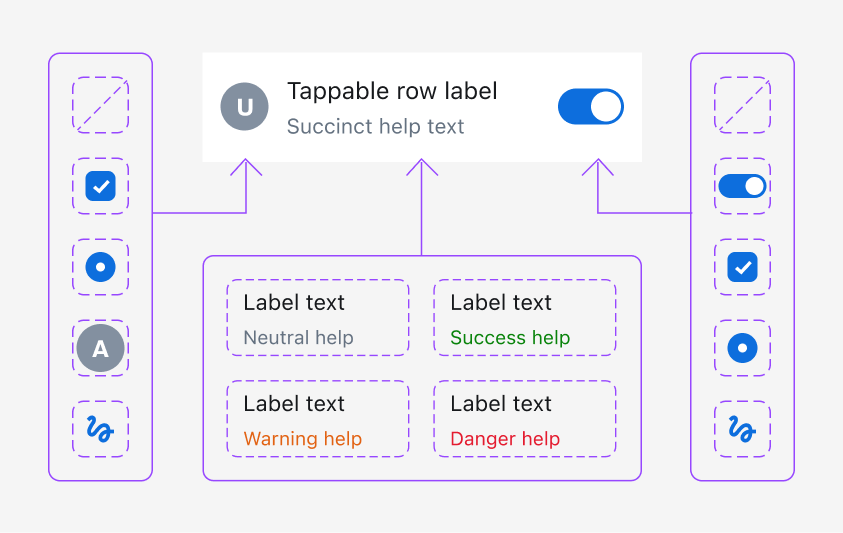
Core Library
High tolerance for complexity, low tolerance for repetition.
Nerdy and fiddly for precise maintenace, with a focus on good abstractions and minimizing duplication of similar elements. This is where it's okay to have unstyled items in hot pink, or interim components that are never meant to be used directly, but that power things like button internals at higher levels of the library.
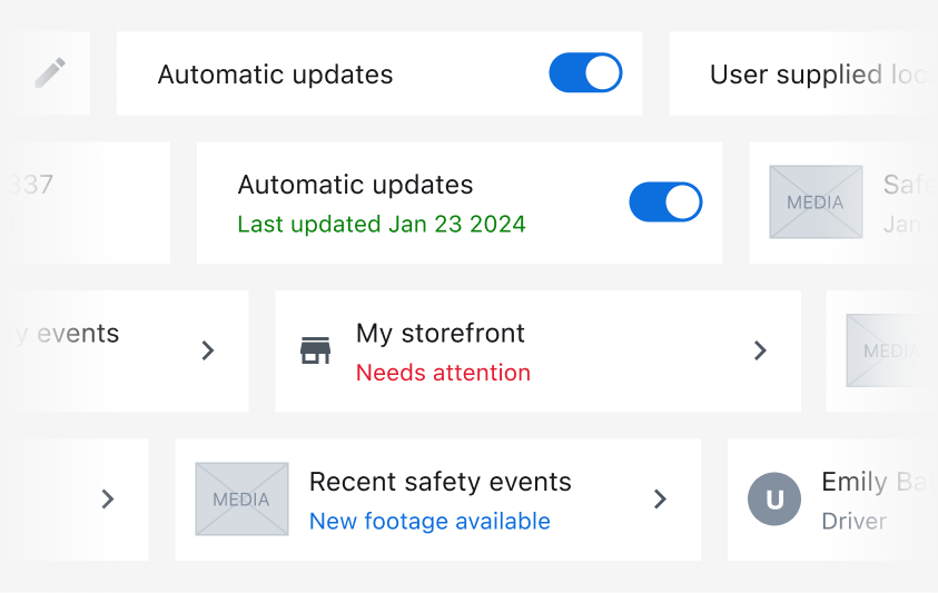
Showcase
Low tolerance for complexity, high tolerance for repetition.
Showcases all the things. Nearly every permutation of size, color, state, etc. Things like help text, error states, and optional icons will all be demonstrated upfront.
Cascading Components
As a design system maintainer, it's important to build with abstractions that are reusable, but not duplicative. Making similar changes to 50 instances of the same thing is tedious and error-prone. The core library is built in layers, with small parts that are reused in multiple places so that changes in select areas cascade through the library at large.
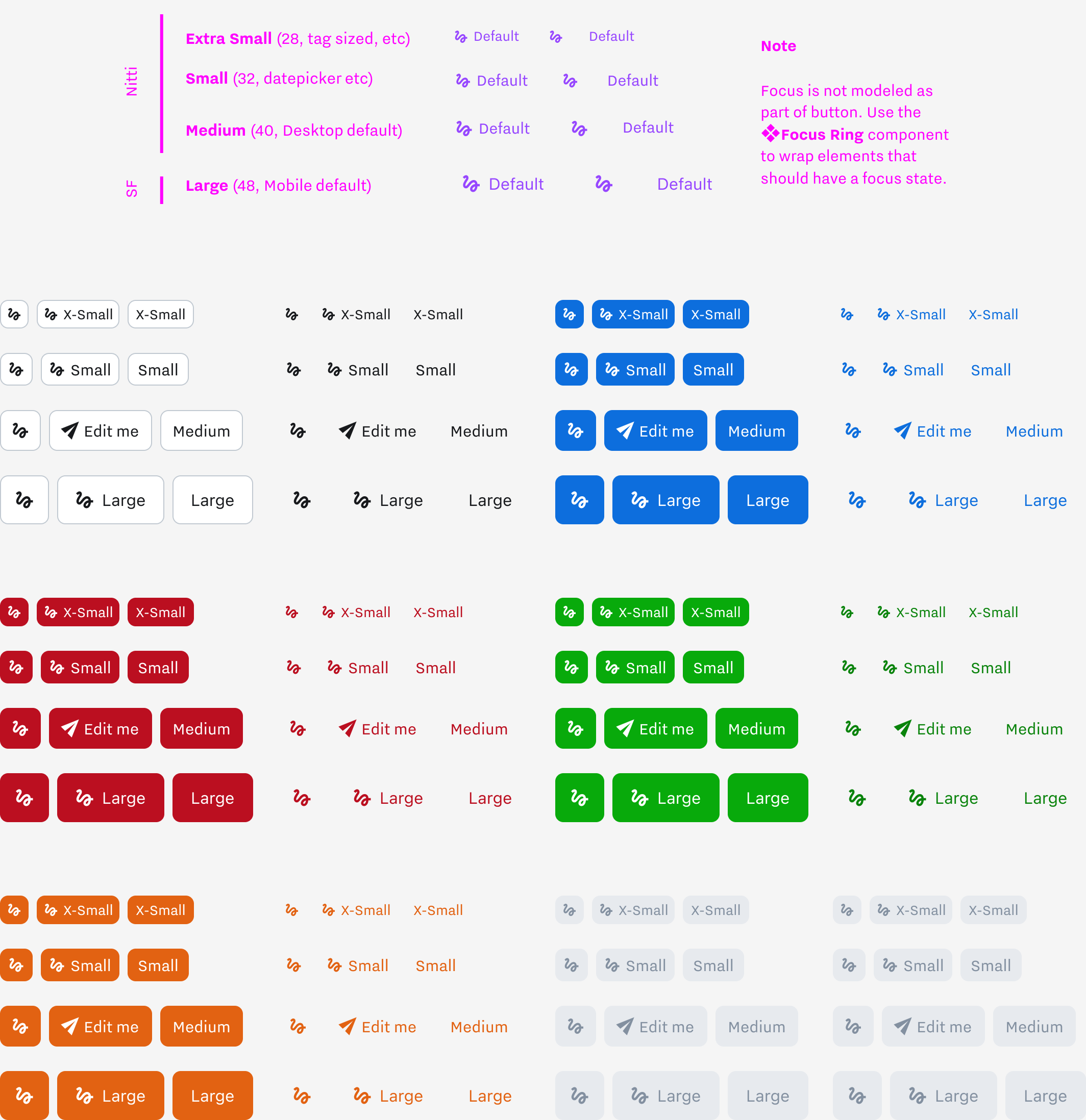
An unthemed component implements different text and spacing combinations to set button dimensions. Each semantic button extends this with its own colors while keeping a single maintenance point for the logic that drives selectable icons, editable text, etc.
Inputs and Form Elements
Samsara’s design system supports the usual cast of form elements, but with a focus on being comprehensive and ergonomic. Every component has full support for things like form validation and interactive states, designed to be configurable from the top level. Elements are WCAG compliant out of the box.
I’ll spare you the view of a million textareas, and instead show some key features that make the library stand out from a designer experience perspective.
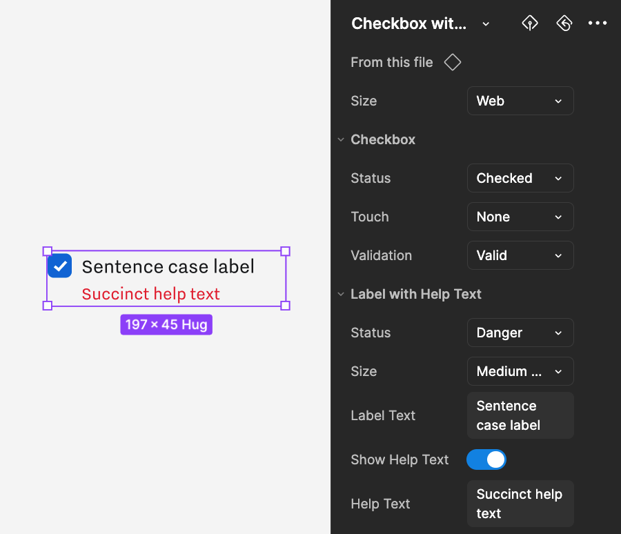
Nested Component Properties
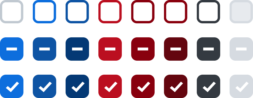
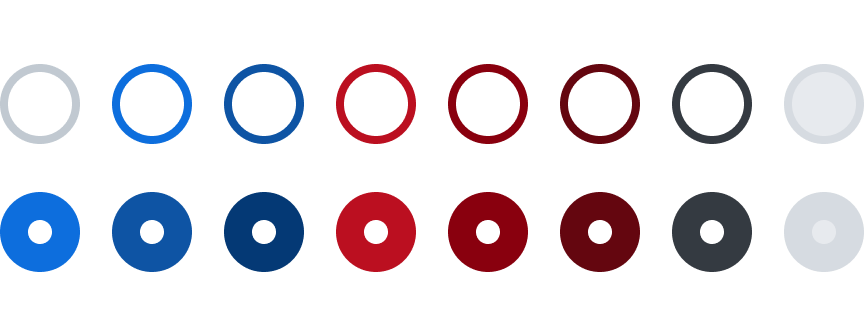
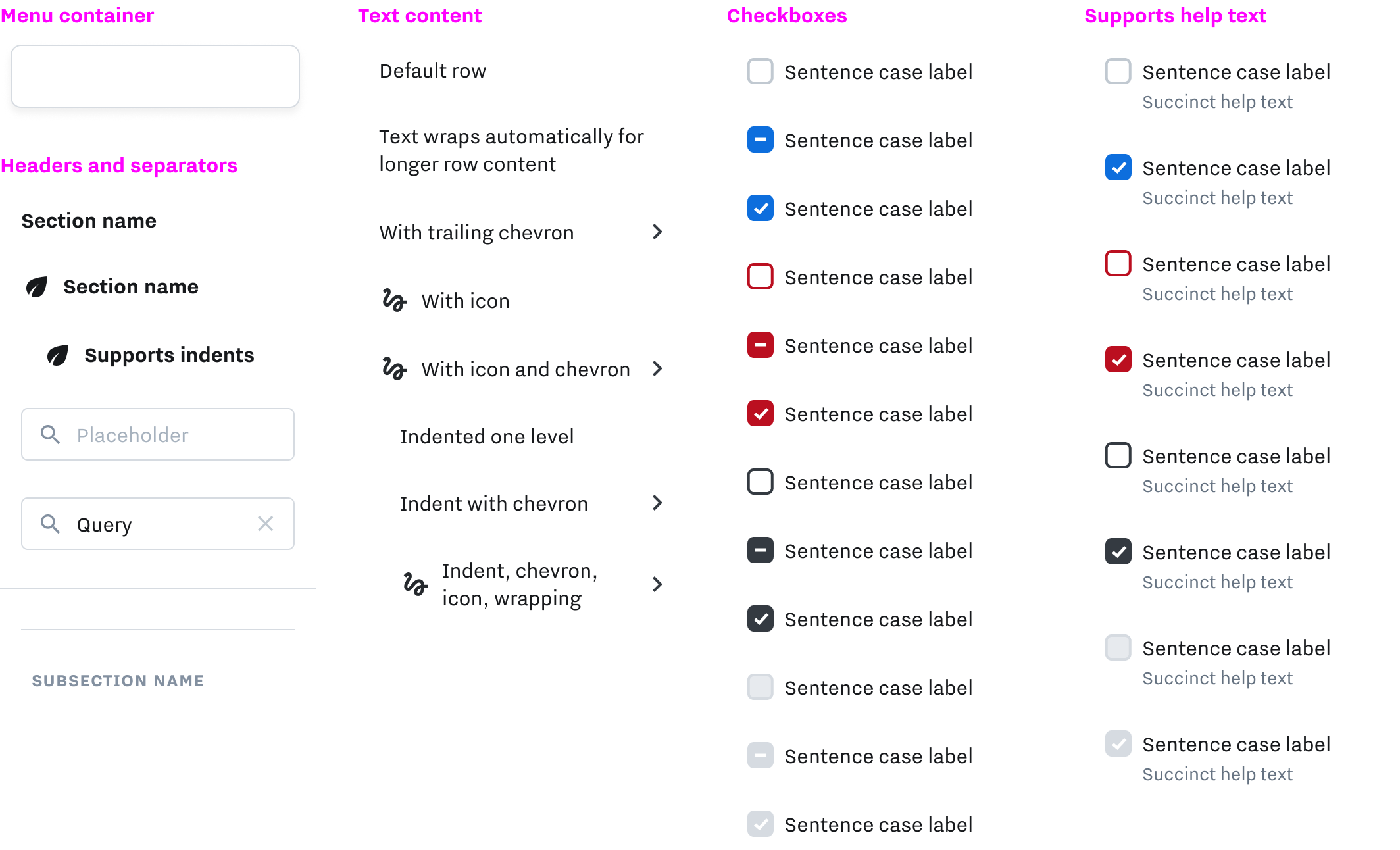
An example of how checkbox primitives (below) are incorporated into larger ready-made components. Checkbox properties like validation and touch state propagate upwards and display alongside label and help text properties.
I chose “Sentence case label” as the default text to intercept a question that came up frequently in the #AskDesignSystem slack channel.
Form Group Components
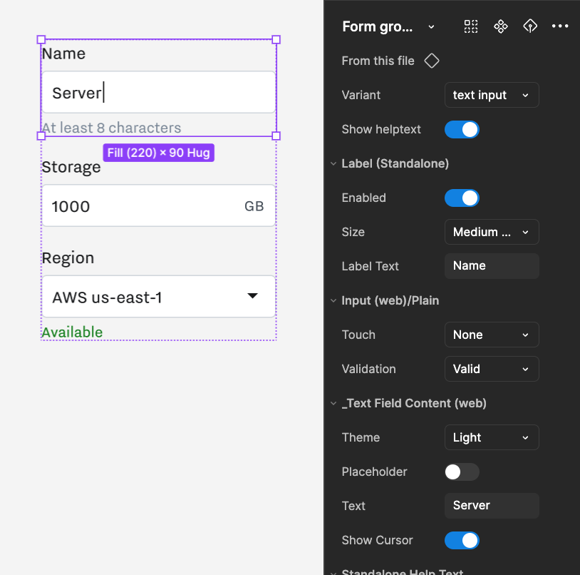
No more checking to see exactly how far a label should be from a text box.
The library offers form group components out of the box, with support for many different input types, validation and help text, as well as optional niceties like an animated cursor that blinks when used in a prototype to make still moments feel more realistic.
Tappable Row
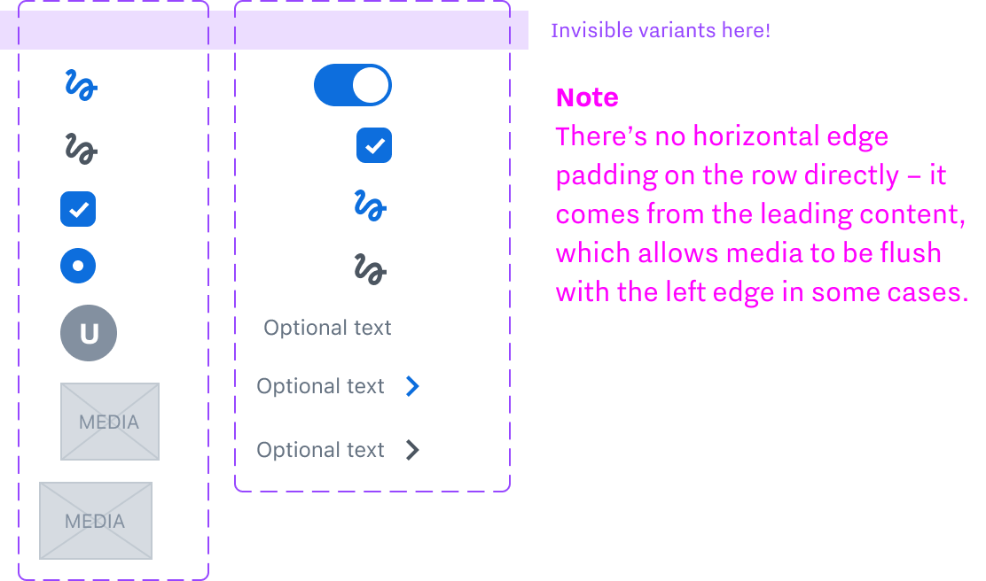
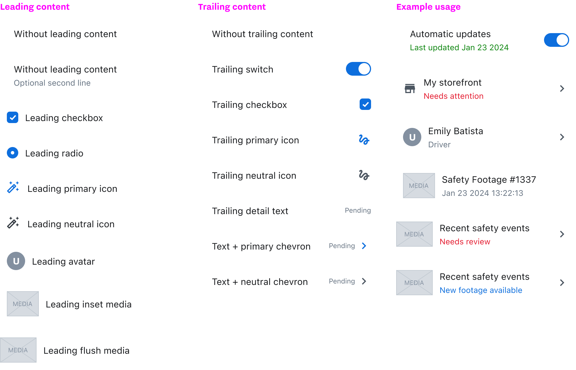
A robust mobile row component combines form, text, and media primitives into something expressive enough to power custom UI all over the app. Universal support for help text and trailing text make it easy to surface validation status or other metadata. Chevrons show when a row can be drilled down for additional content. Media support is used for things like mini-maps, video stills, footage previews, or footage groups.
Subcomponent Variants
Notes in the core file warn about hard-to-see variants and explain how these subcomponents drive the spacing on their parent element.
Internationalization Ready
Naming conventions eschew "left" and "right" in favor of "leading" and "trailing". This makes it painless to add support for RTL or other non-latin languages without breaking or invalidating the names of everything.
Example usage below
Badge Variants
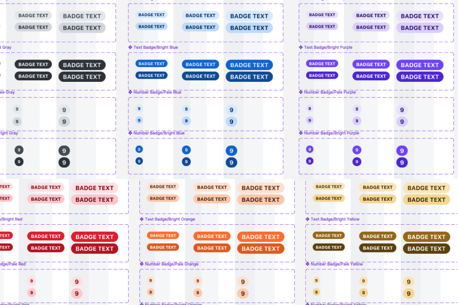
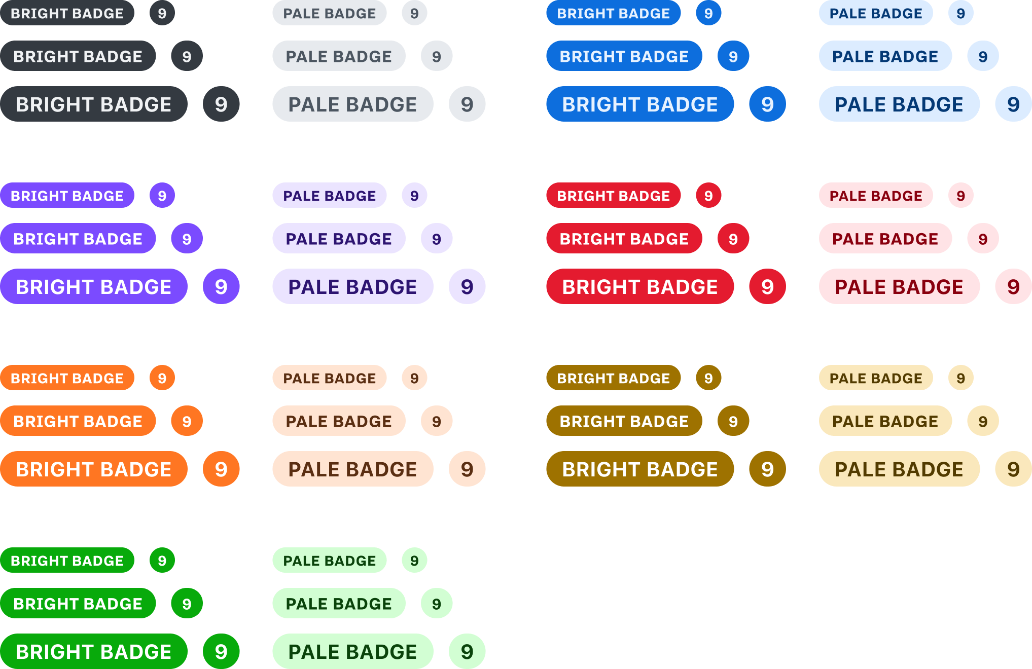
Badges in the UI fell into two major use cases. The first was text tagging and data annotation. The second was notifications or appearing atop something to count it. The default badge has generous side padding to give the text room without feeling too cramped, but an optional numeric variant has custom padding that let its bounds stay circular when used for single digit numbers. Without this, there were often not-quite-circles that undermined the polish of the interface overall.
Anyone who’s dealt with WCAG compliance knows how tough it is to get yellow to pass. While the brown we used isn’t the most beautiful, it’s in keeping with the rest of the color system, and most importantly, it meets our accessibility goals.

Link Styling
Different teams had different conventions about what icon – if any – should signify a link that points to another site instead of somewhere inside the application. We adopted a single convention for the “external” icon and made it an optional property in the Figma component.
A tabular variant that shares the default text color exists to prevent spotty-looking tables where half the cells are blue. Both kinds of links are underlined on hover and down.
Animated Skeletons 💀 🎺
The skeleton component encourages thinking about how a page looks before it’s been fully loaded.
Loaders, skeleton states, and similar components use looping animations for a realistic feel when prototyping.
Menu Builder
This is one of the most satisfying editing experiences in the entire library. The menu builder allows a huge array of interactive menu subcomponents to be dragged and dropped, in any order, to create detailed custom menus for any scenario.
Multiple Indentation Levels
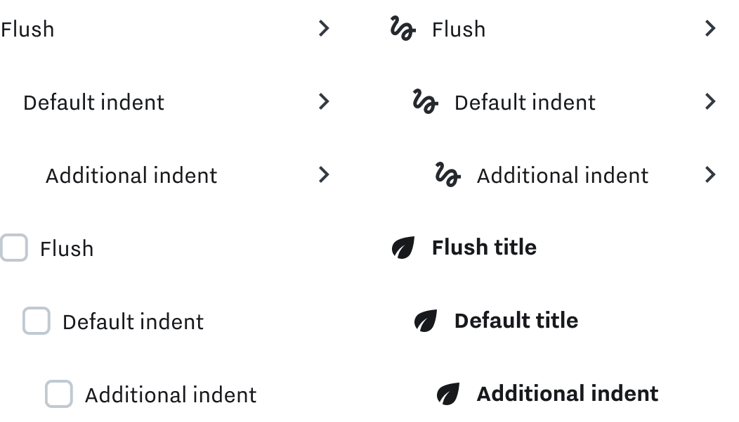
Menu rows support additional indentation for building nested submenus.
